CB Travel
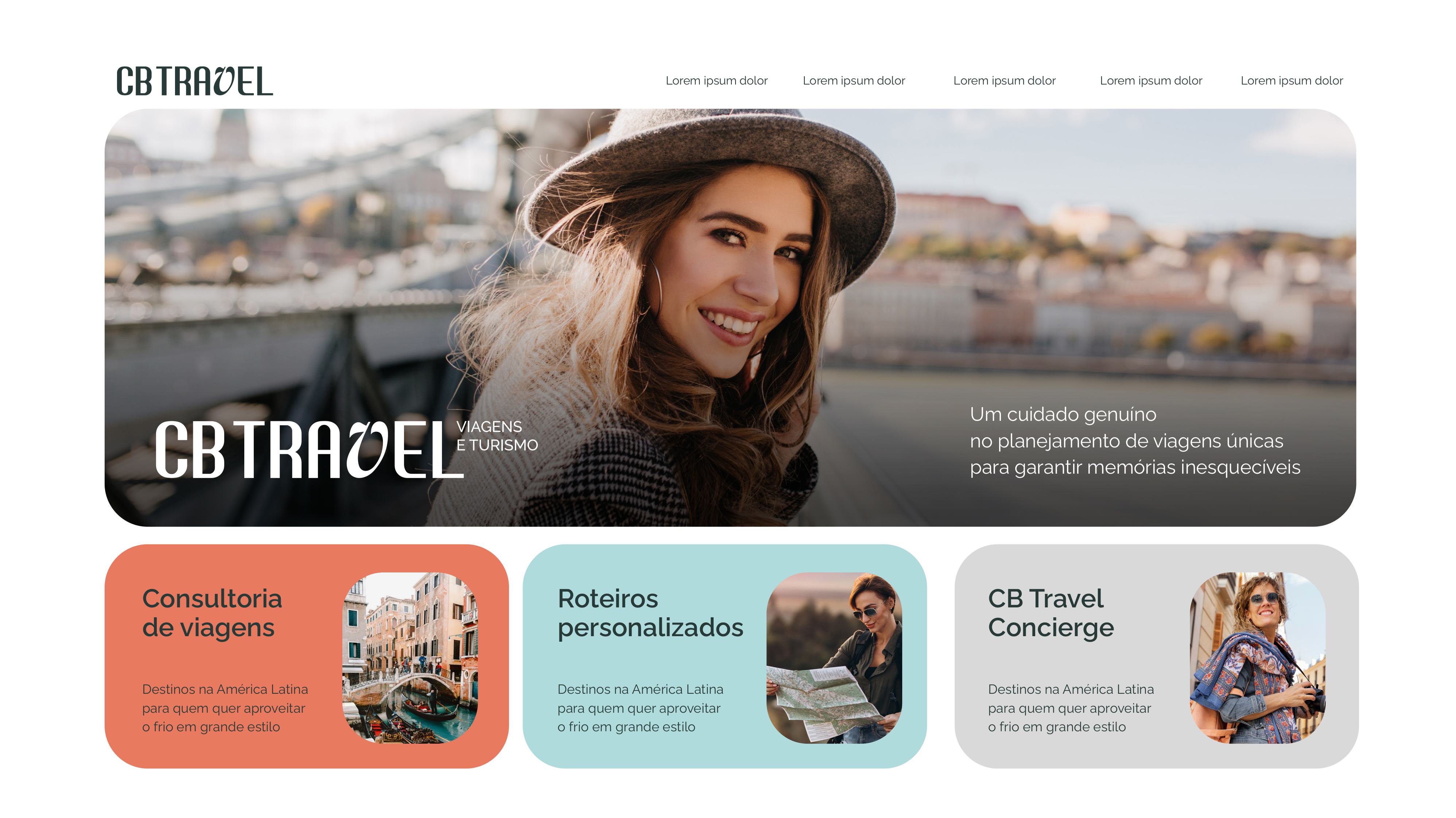
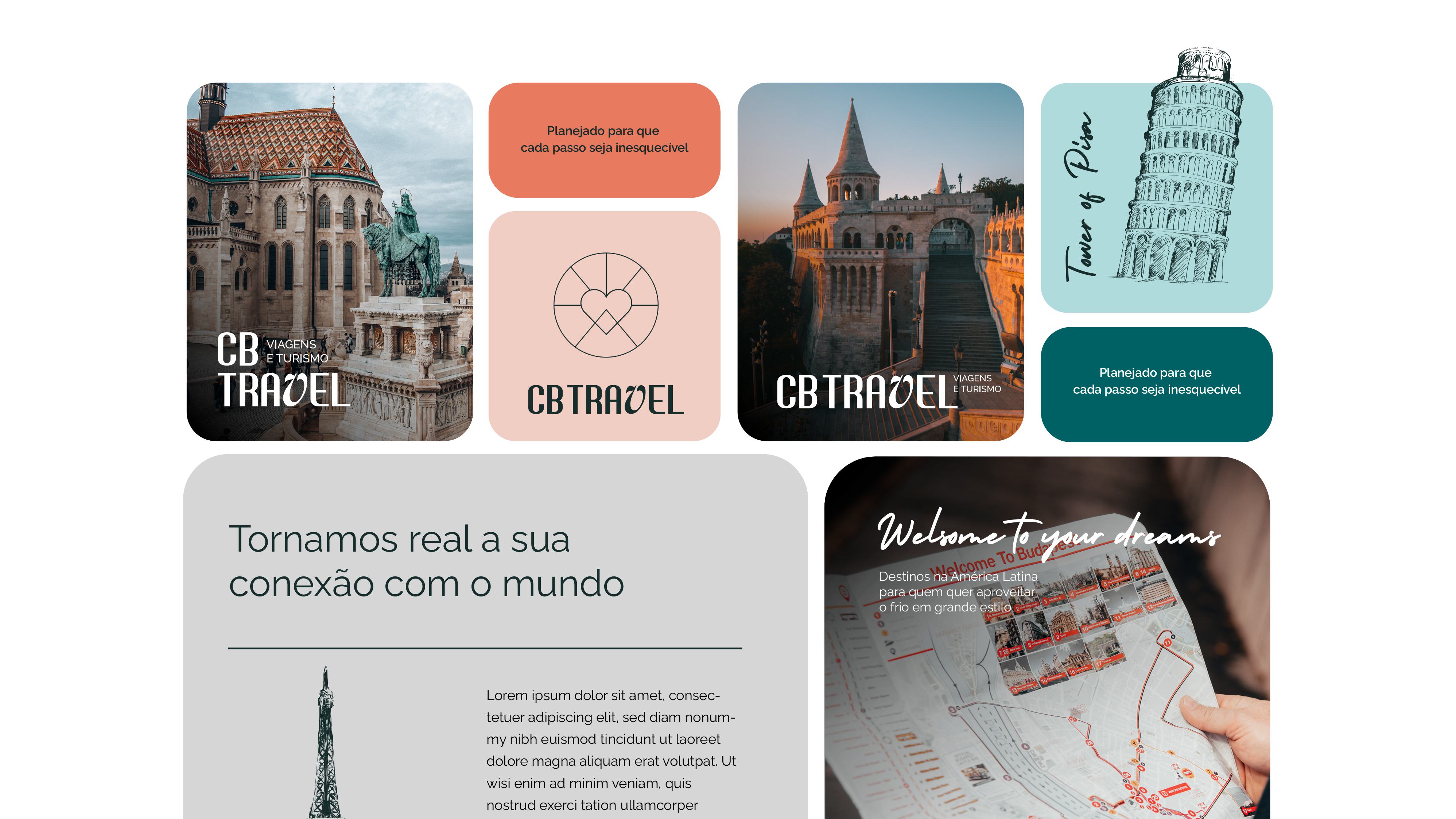
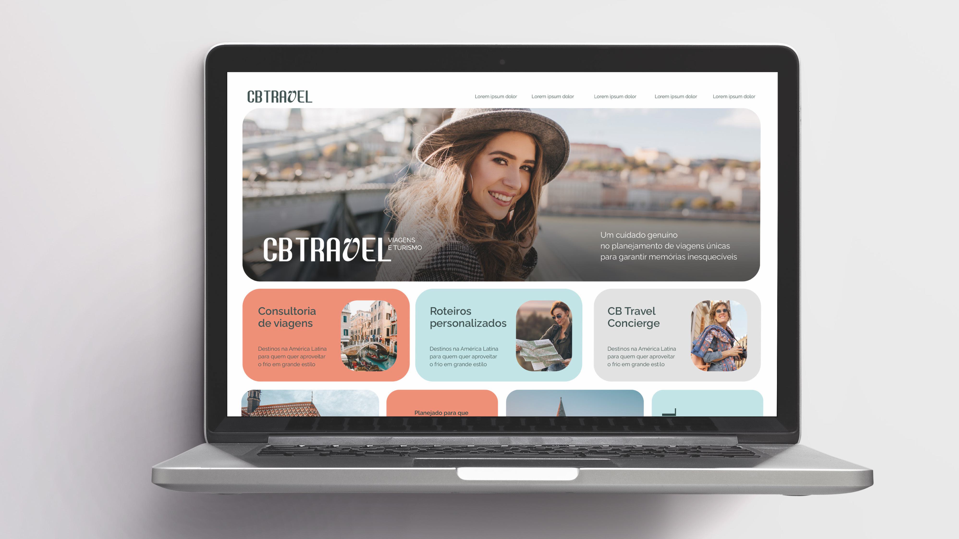
Visual identity for a bespoke travel consultancy, turning the desire to travel into handcrafted, exclusive experiences, with hand-drawn destinations and the spirit of a well-drawn world map.
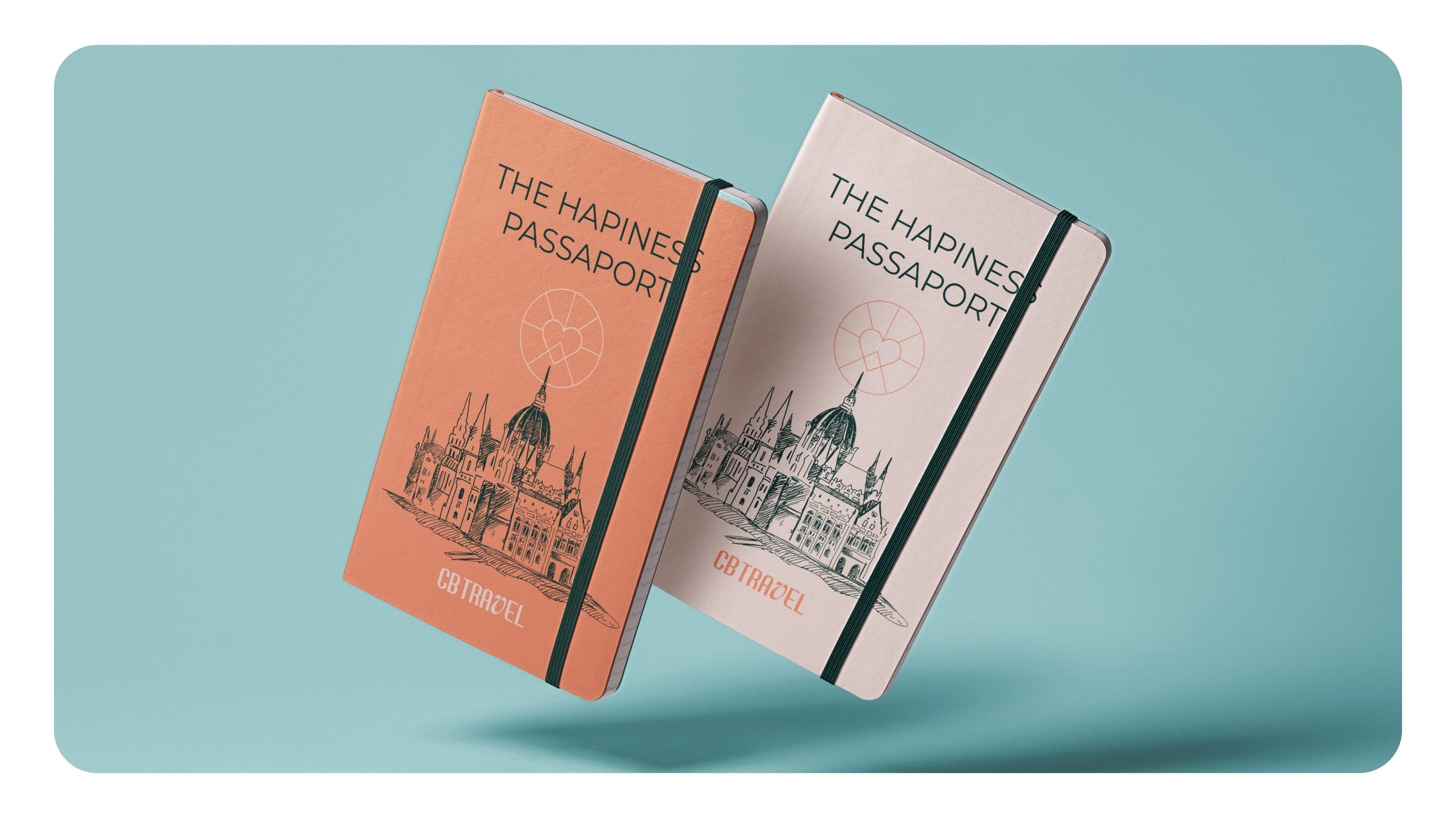
CB Travel is not just a travel agency; it's a consultancy specializing in transforming the desire to travel into memorable experiences.

Cheerful, intelligent, vintage, contemporary, passionate, committed.
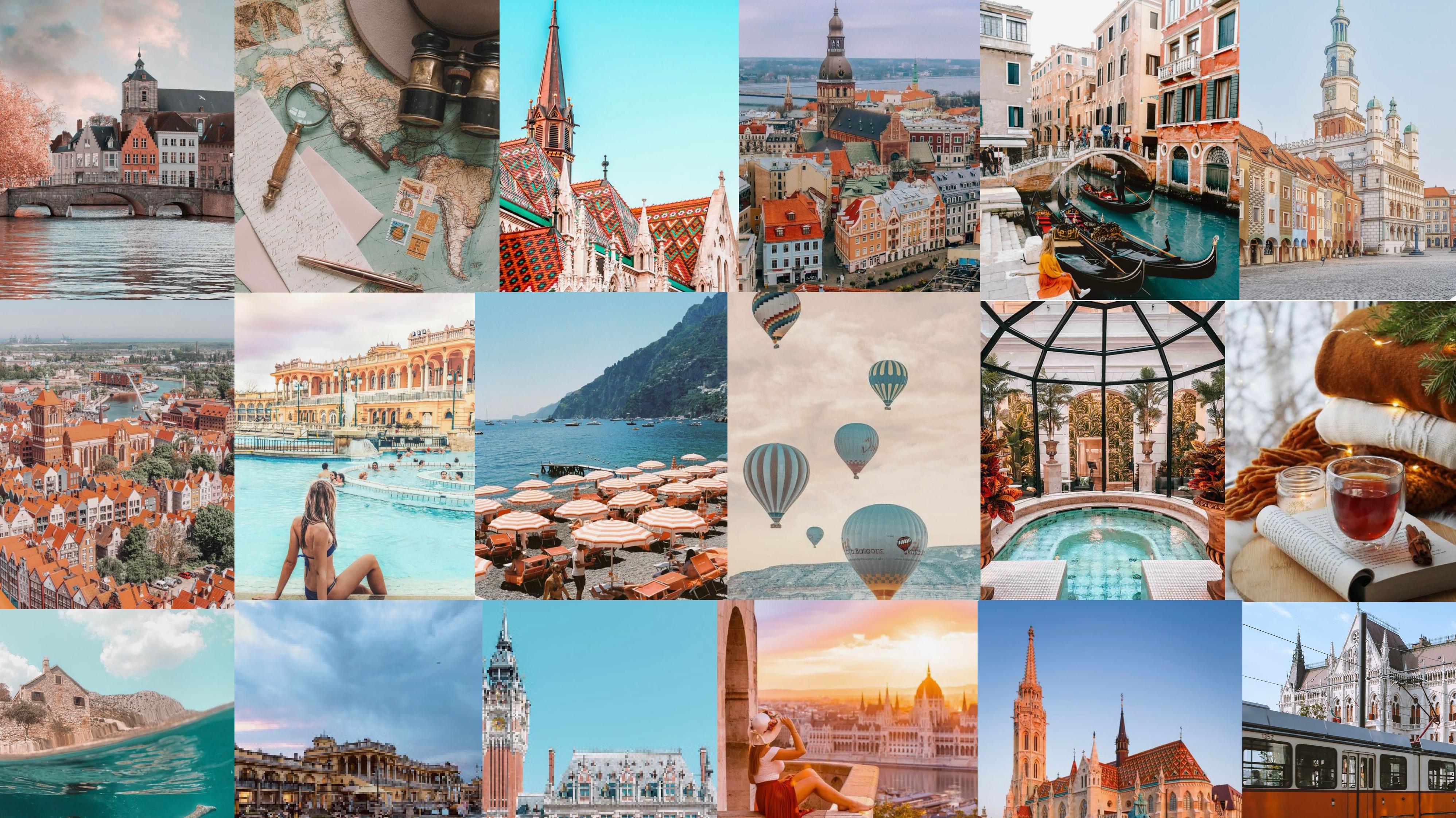
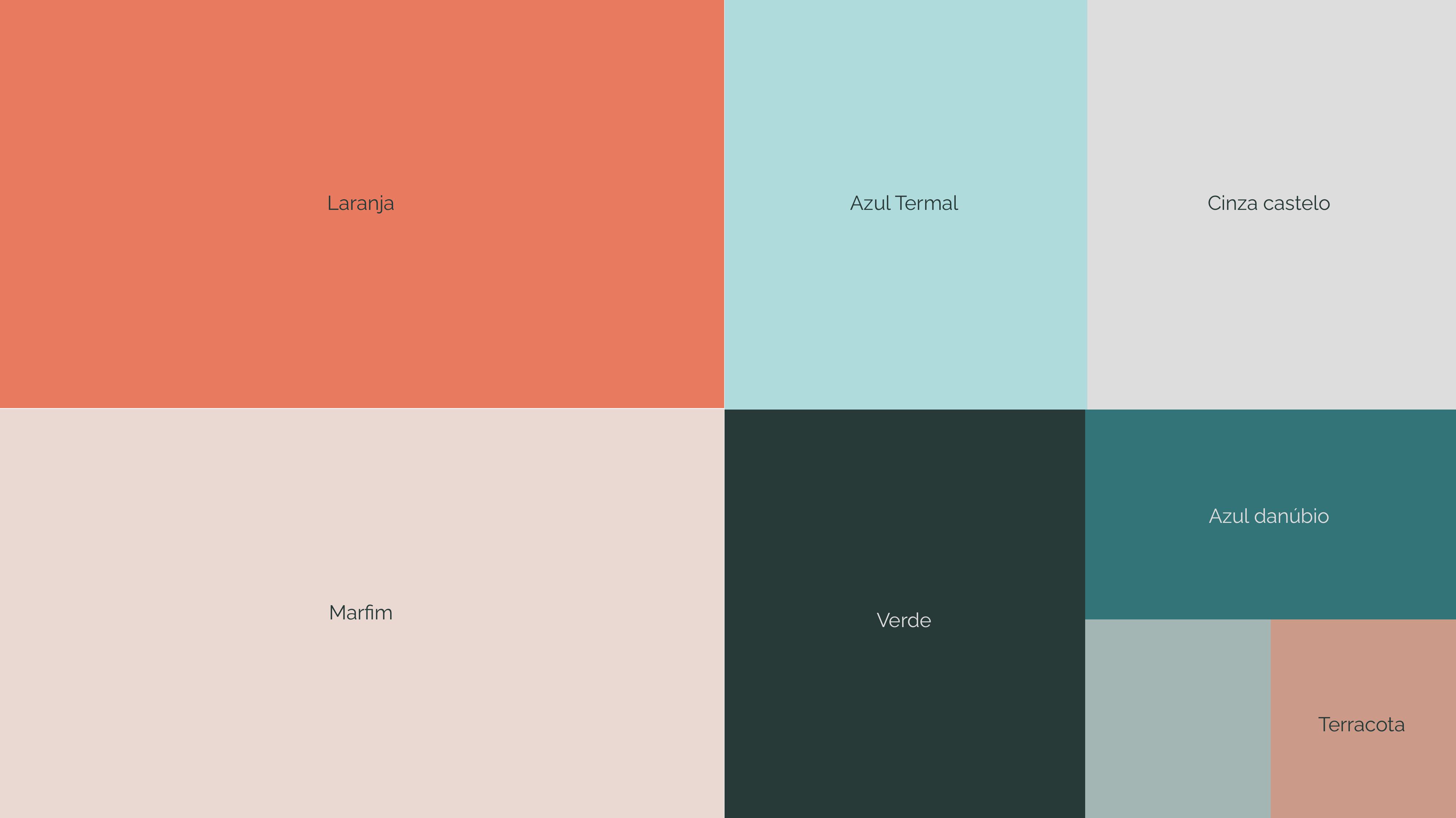
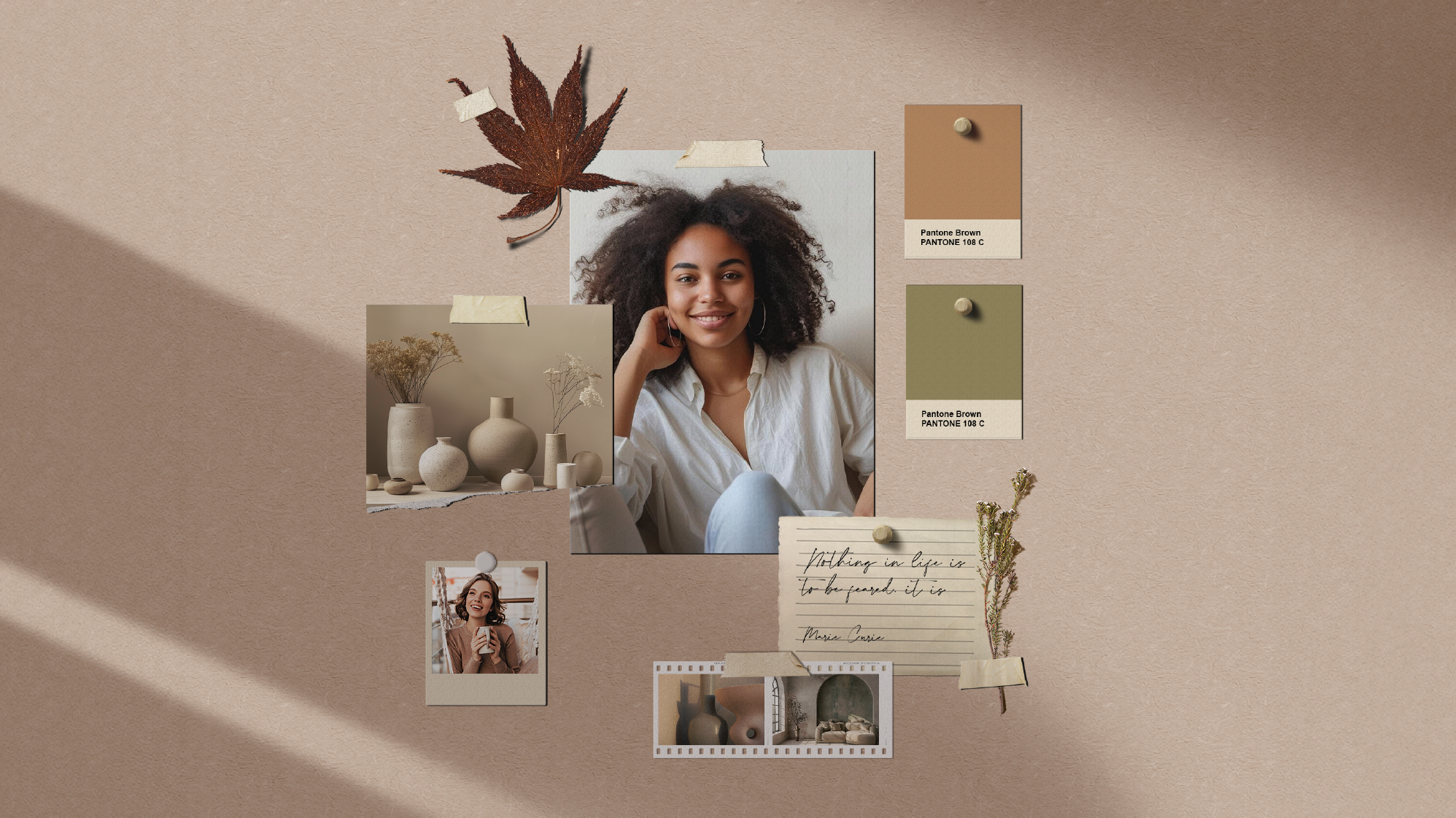
The color choice was strategic to avoid the "boring obvious," seeking sober and sophisticated tones.
Deep Blue: the immensity of the oceans, the boundless sky, and the confidence of a well-drawn world map.
European Orange (matte): the necessary contrast to represent the enthusiasm and modernity of vibrant destinations.
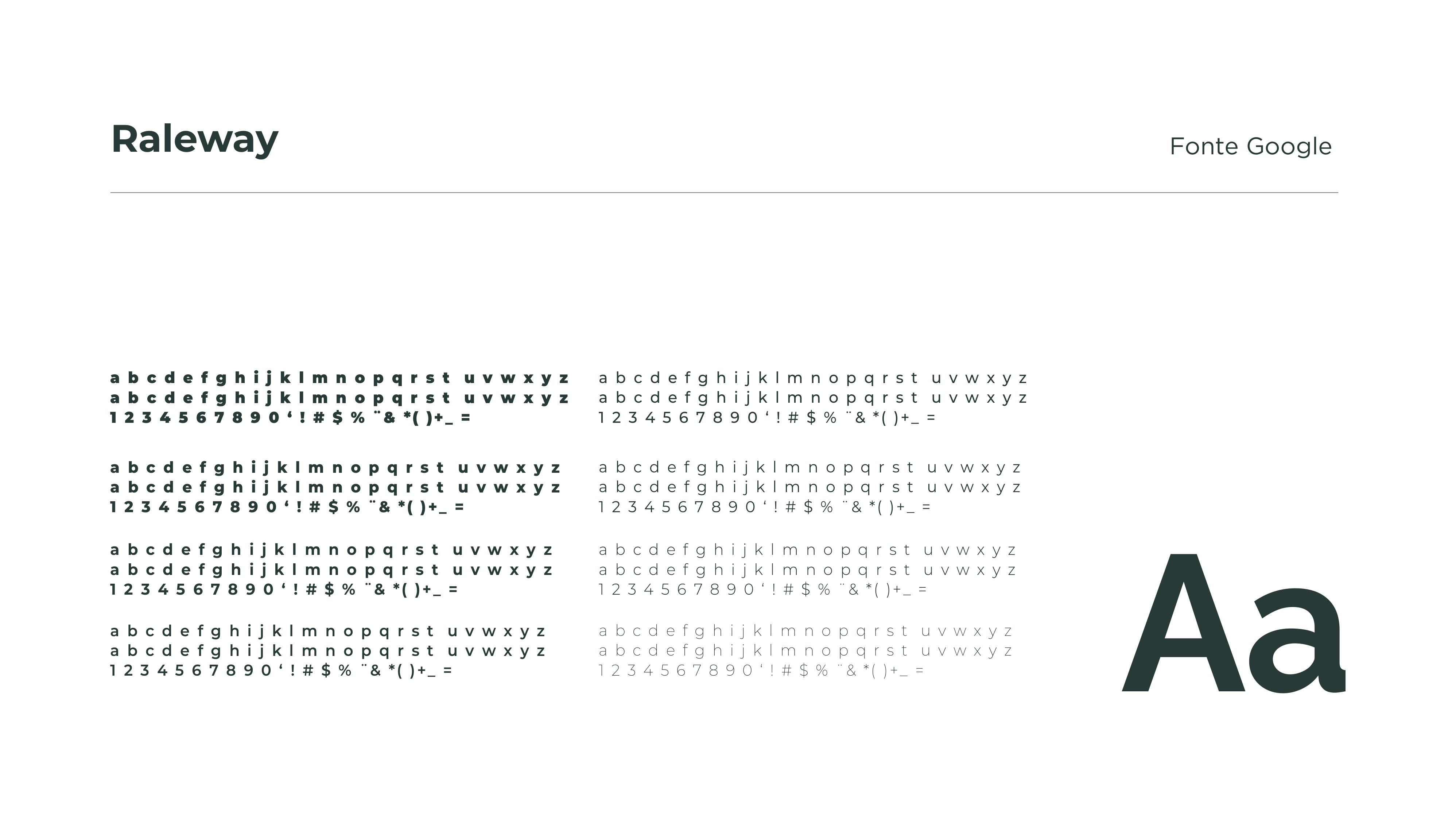
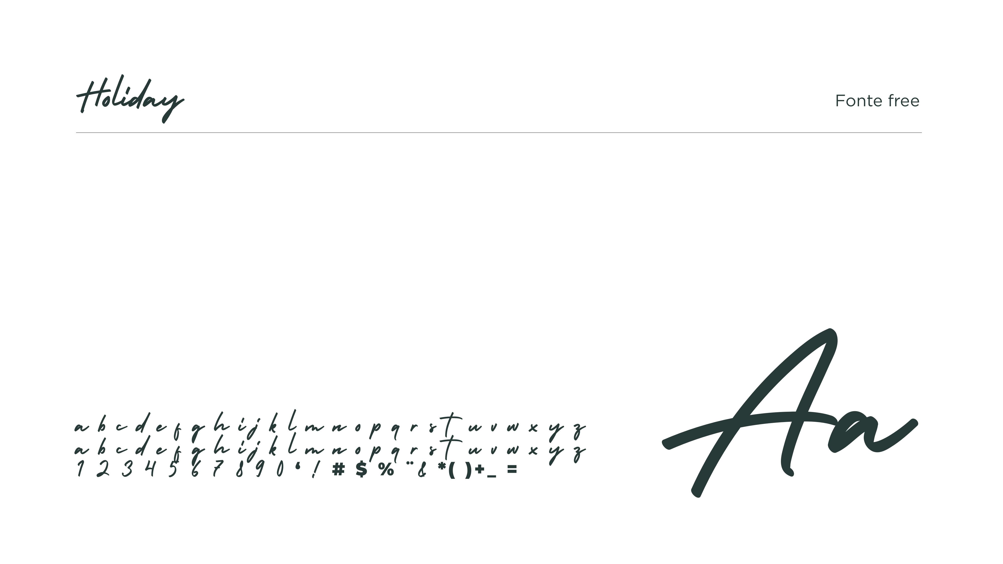

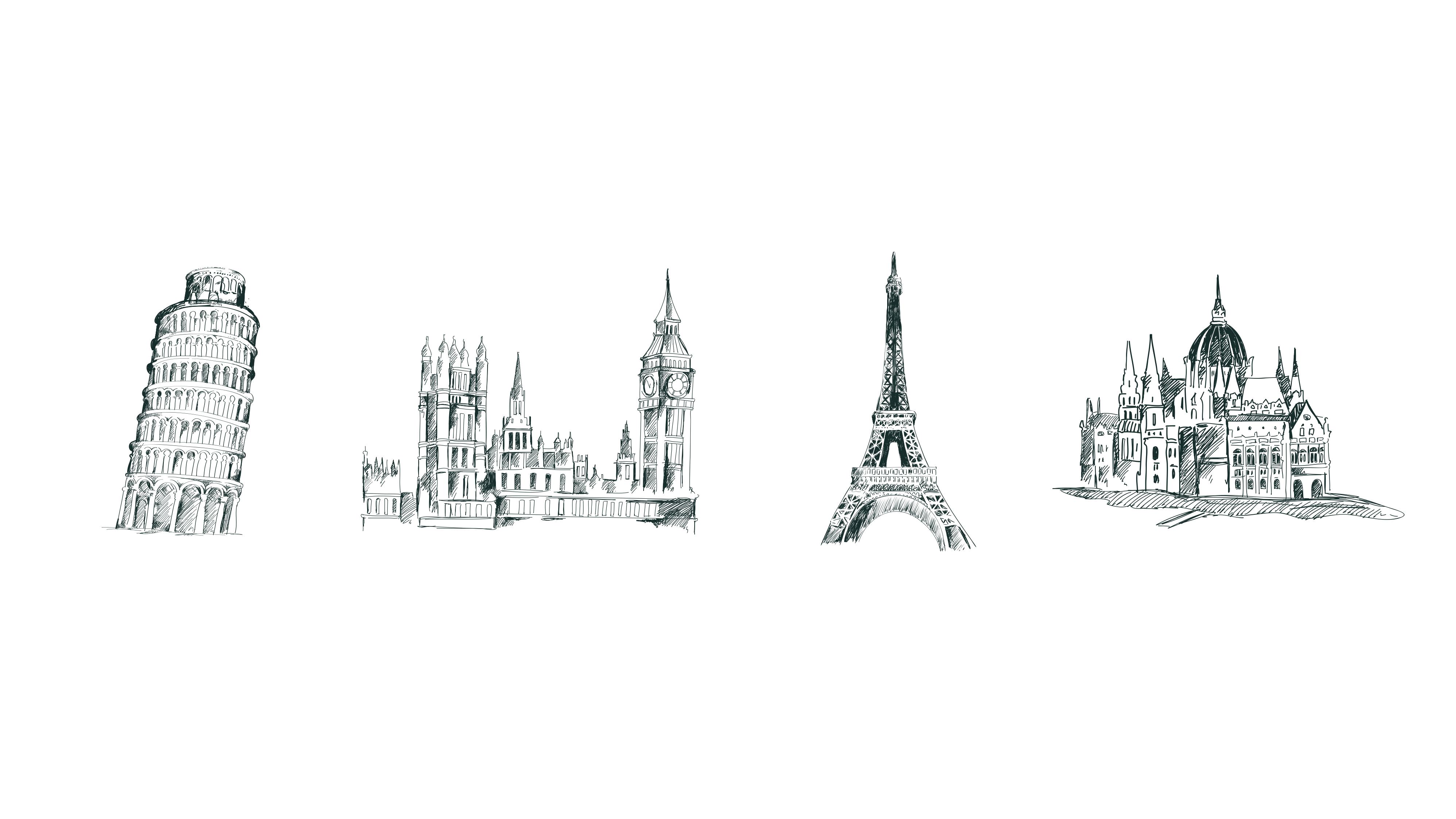
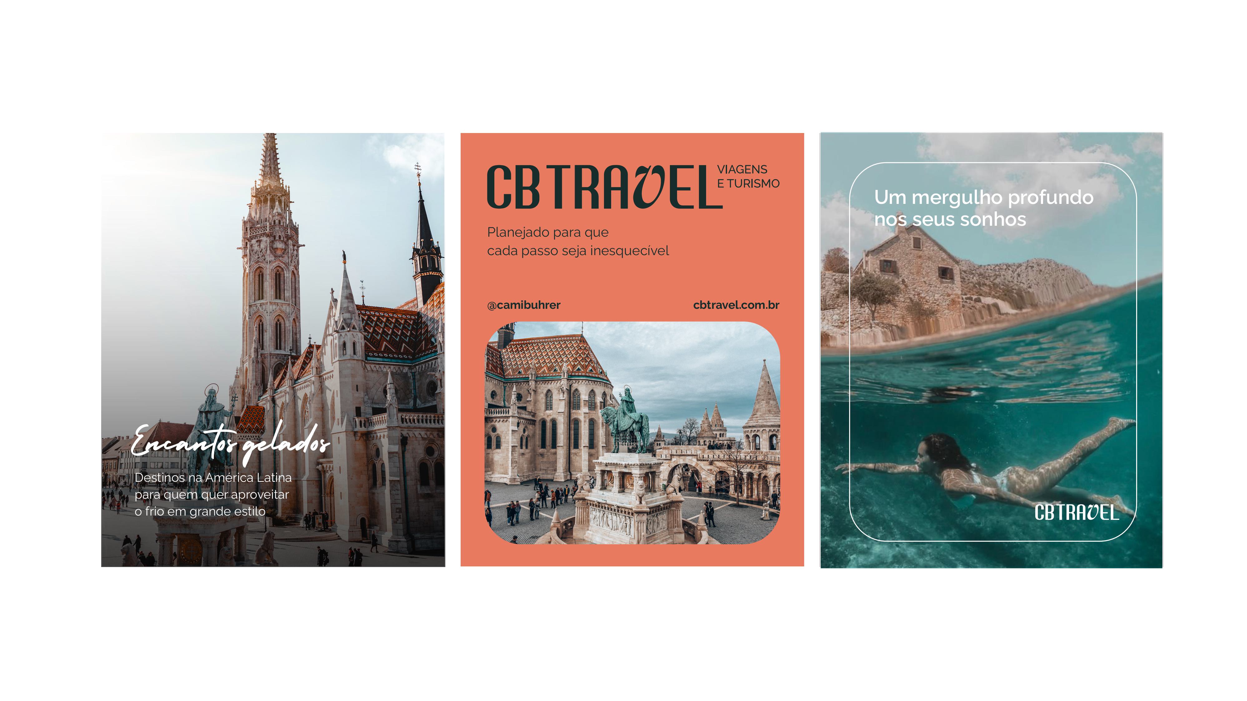
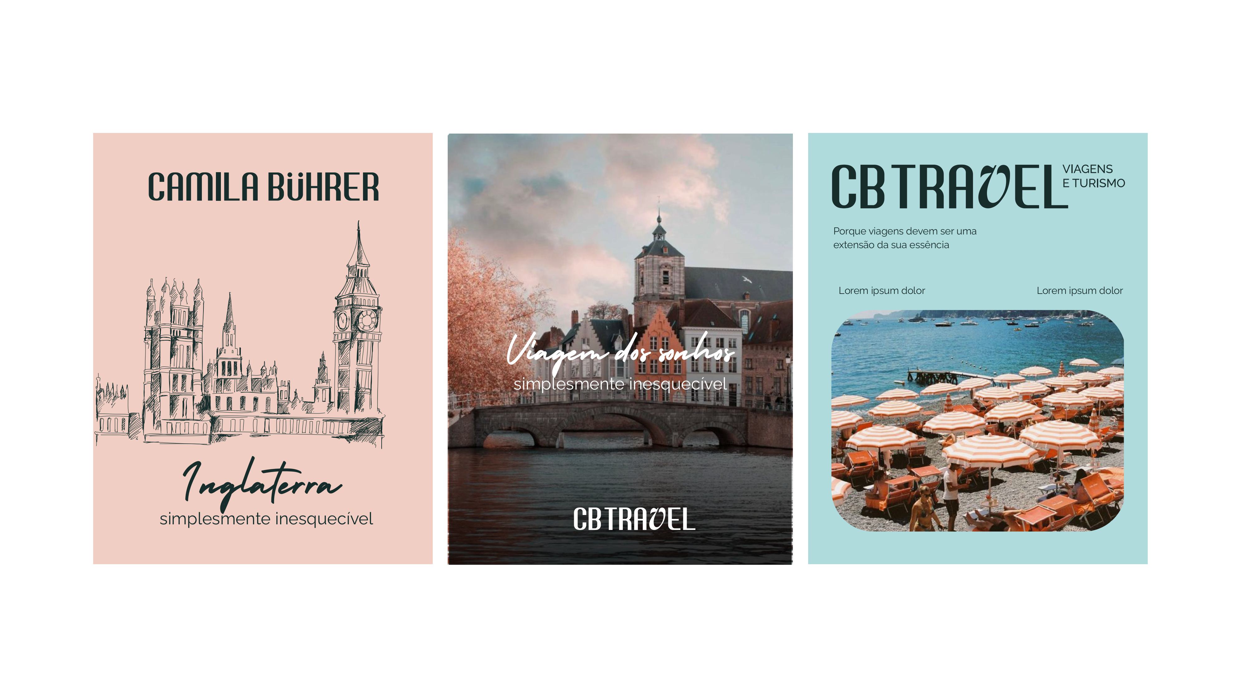
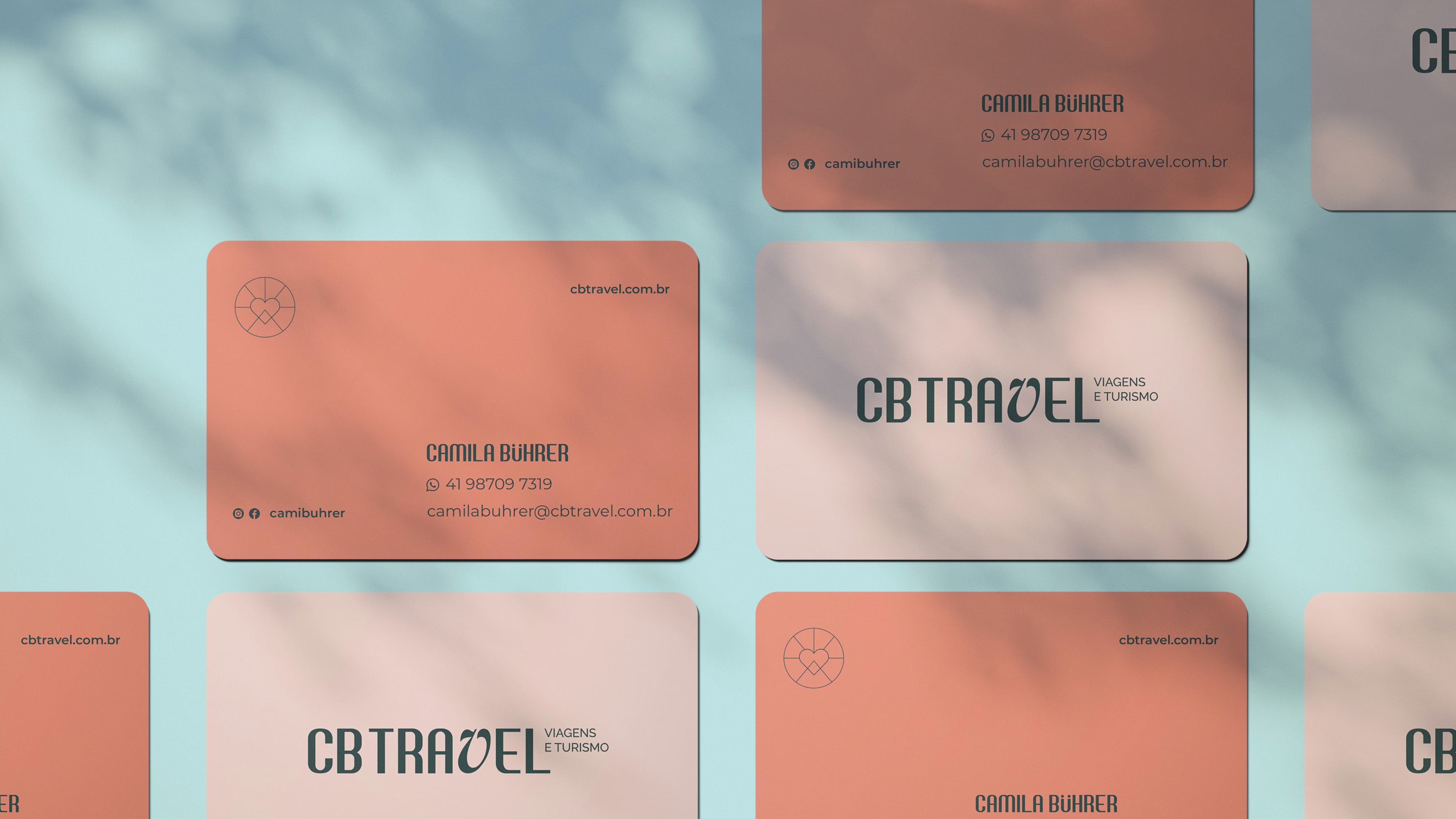
The heart of CB Travel lies in the term "Handmade." Unlike large mass-market operators, here every detail is handcrafted.
- Strategic Consultancy: more than just selling tickets, delivering knowledge.
- Exclusivity: focus on the passenger seeking the extraordinary.
- Experience: design as a gateway to the next destination.
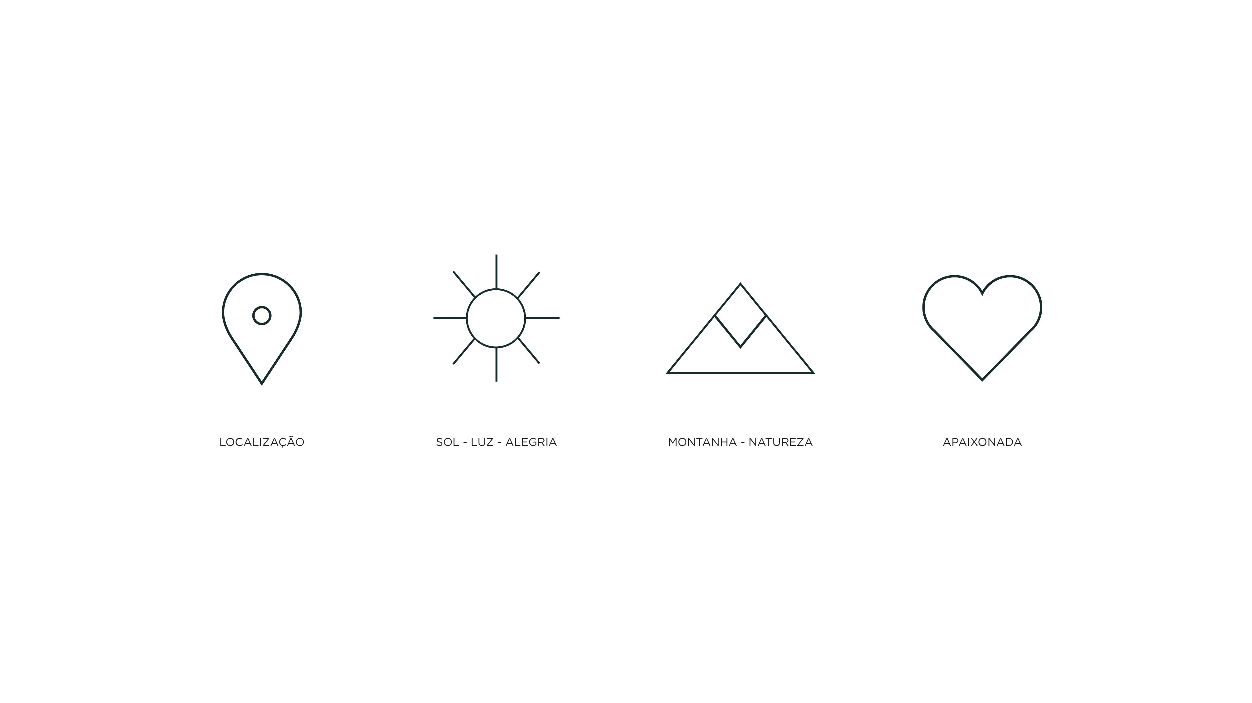
Location, sun, light, joy, mountain, nature, passionate.

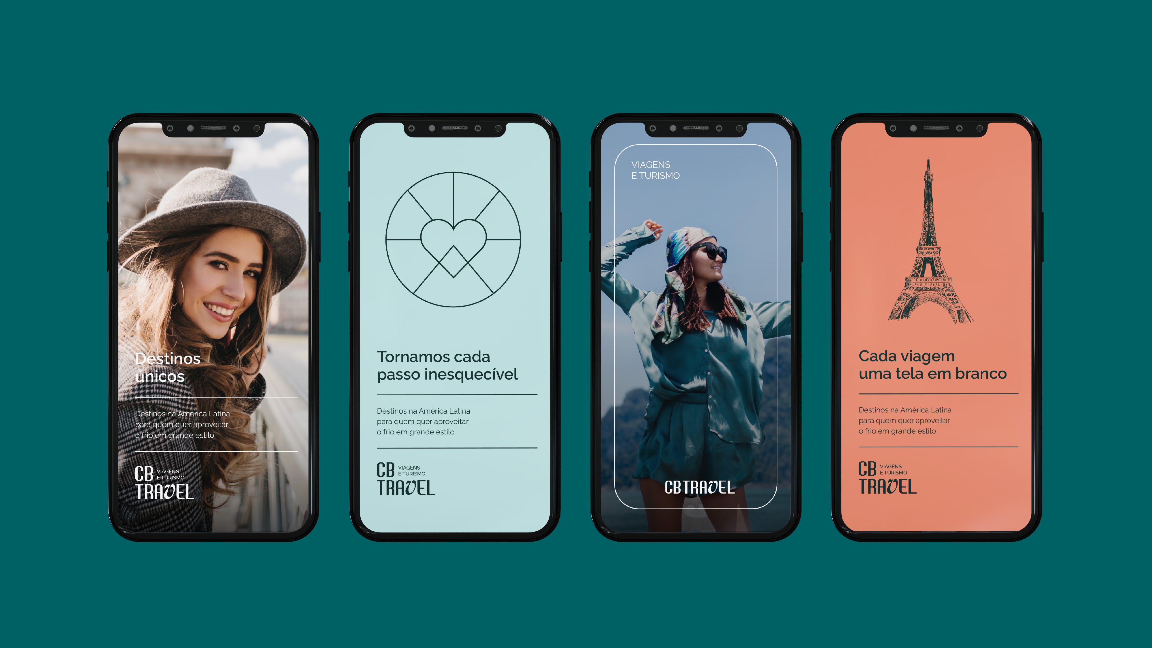
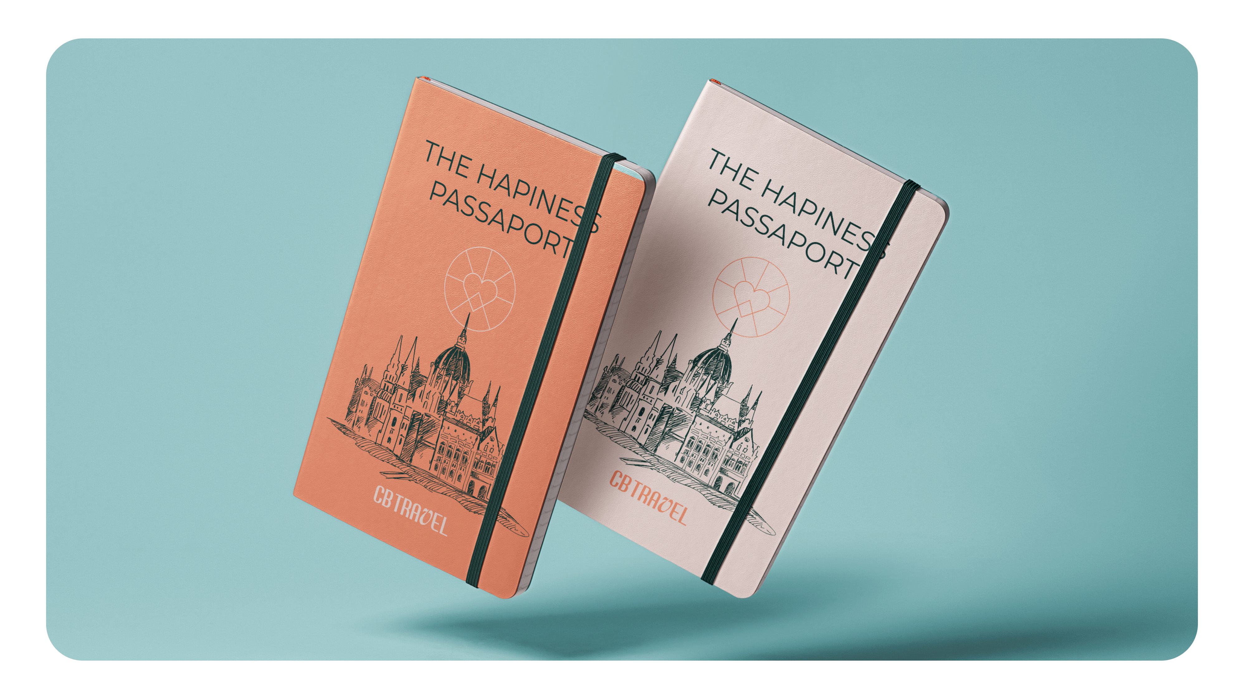
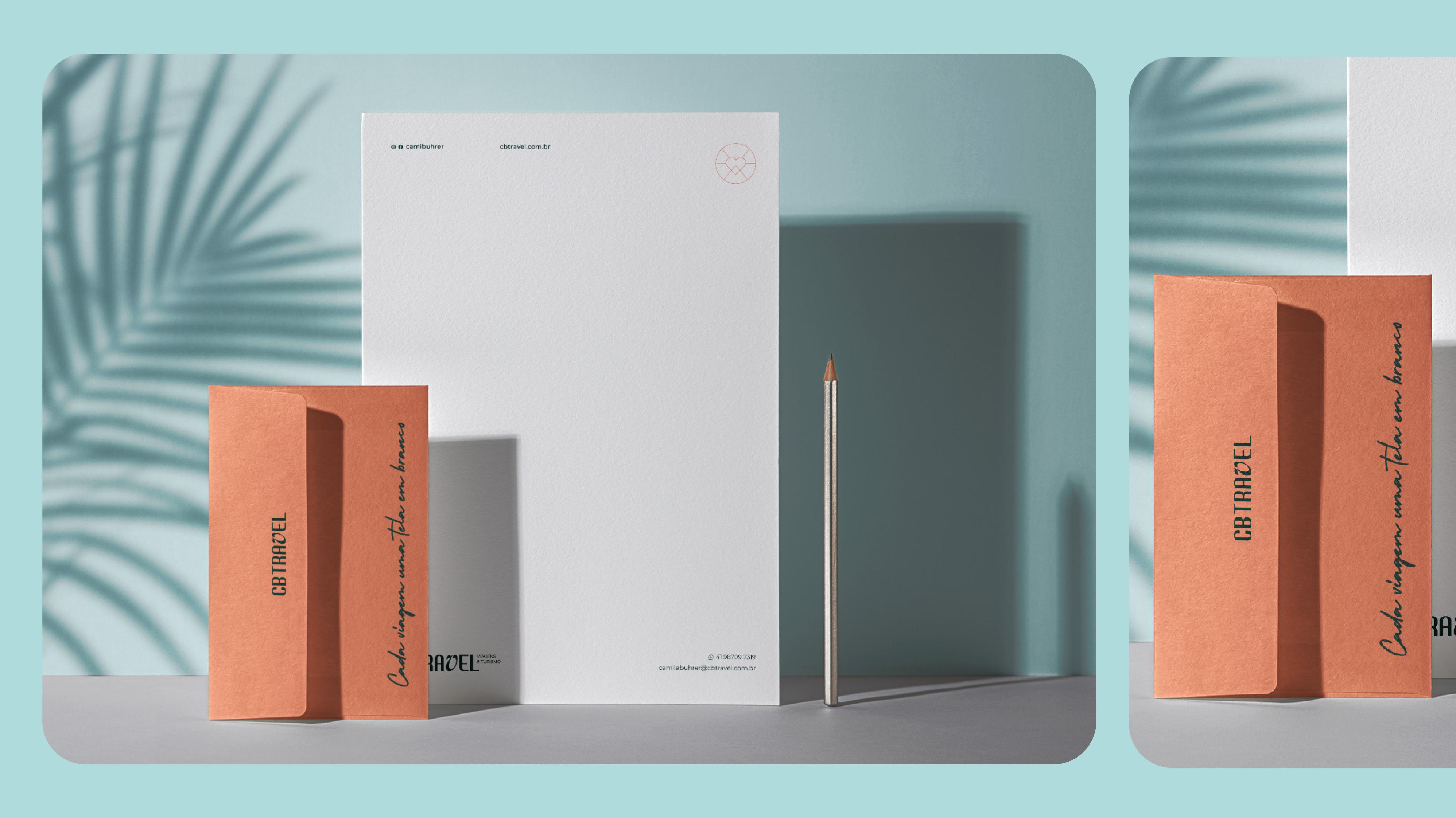
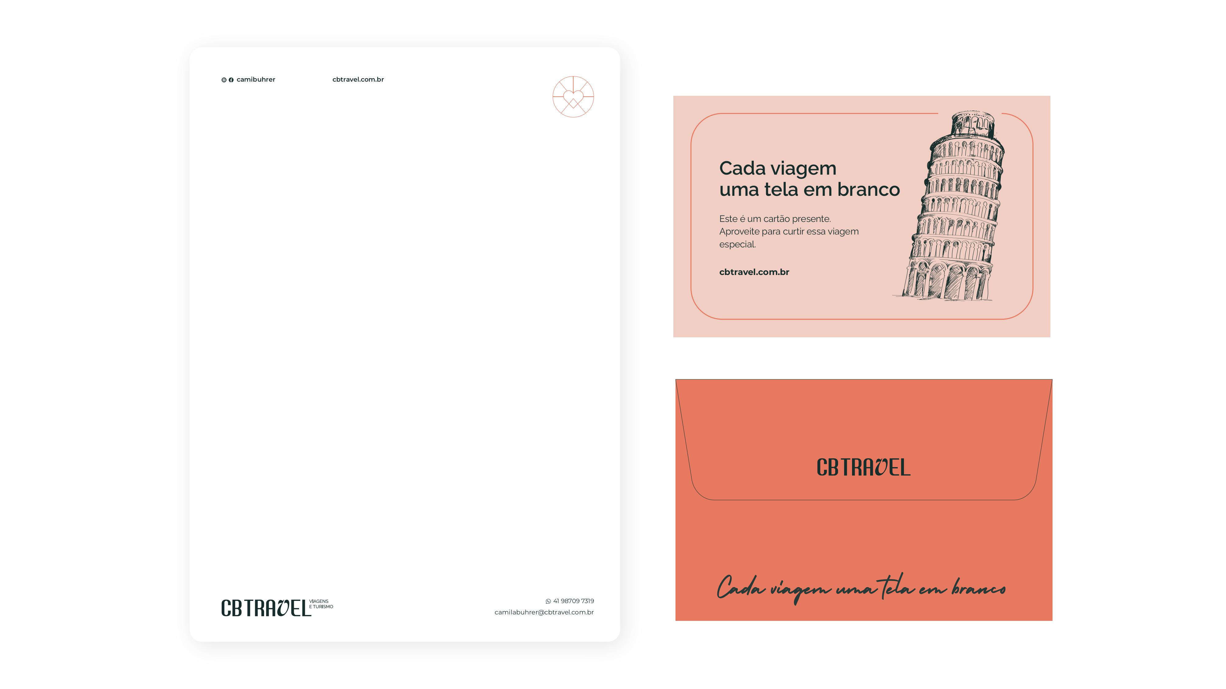
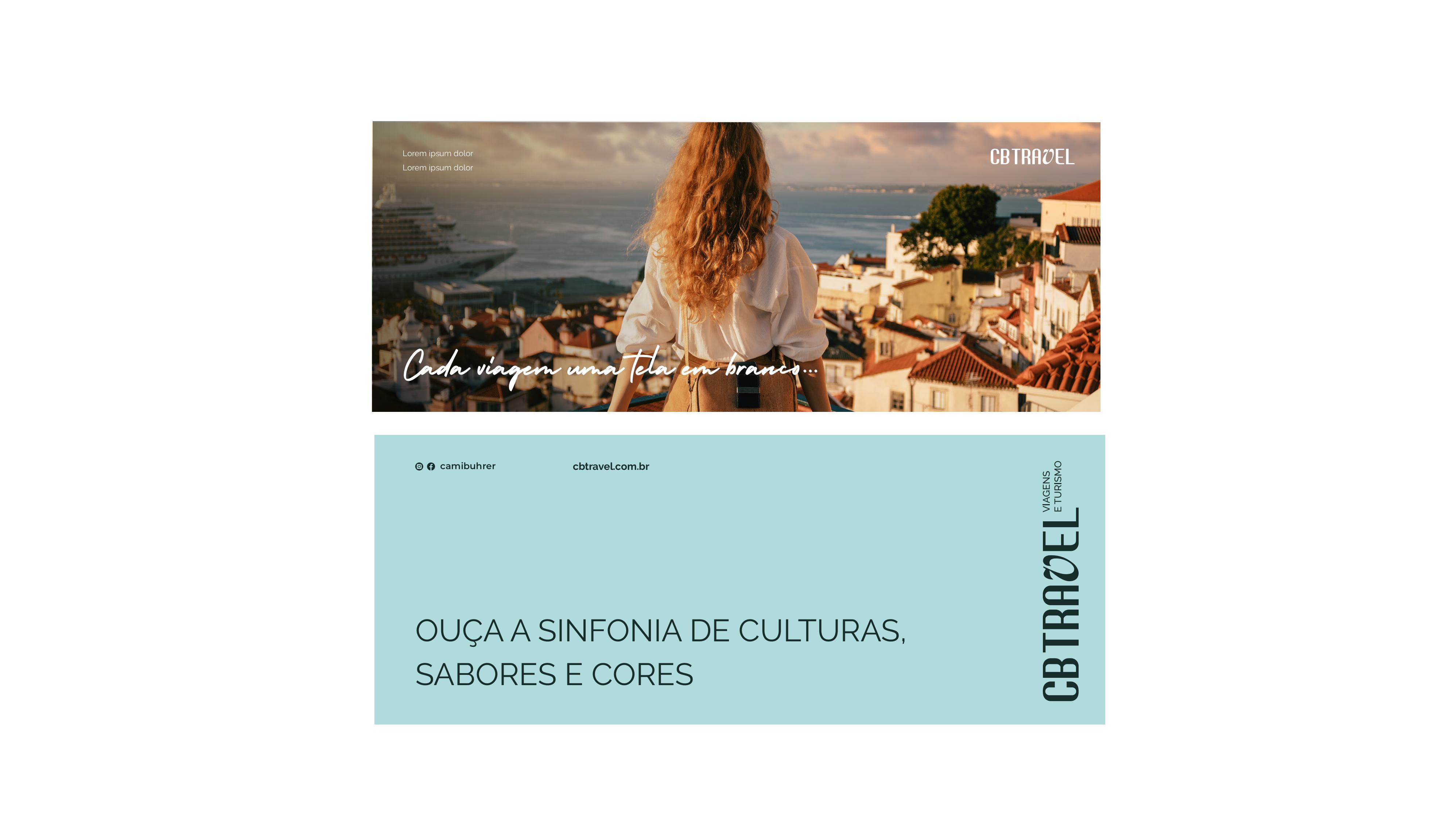
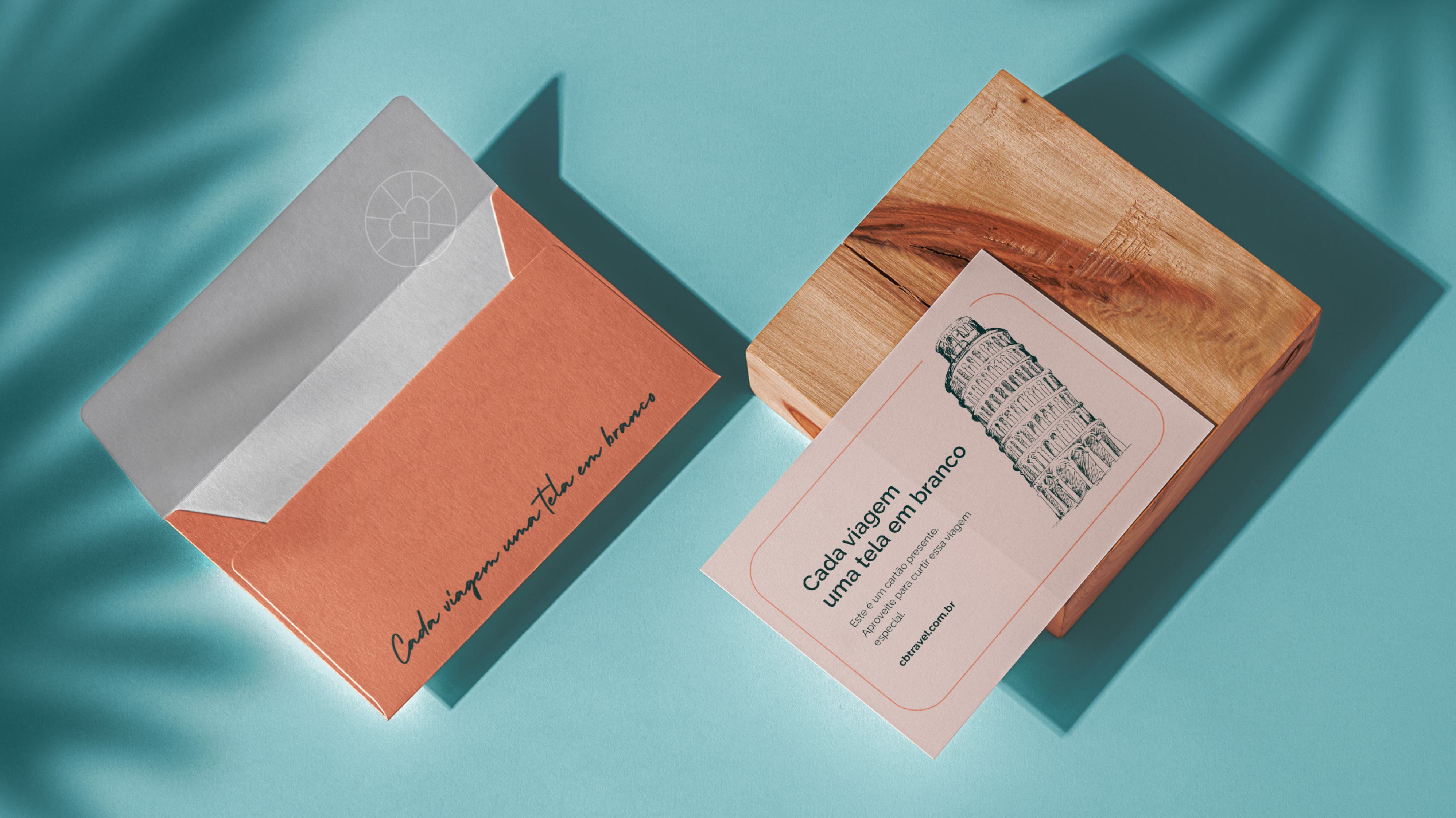
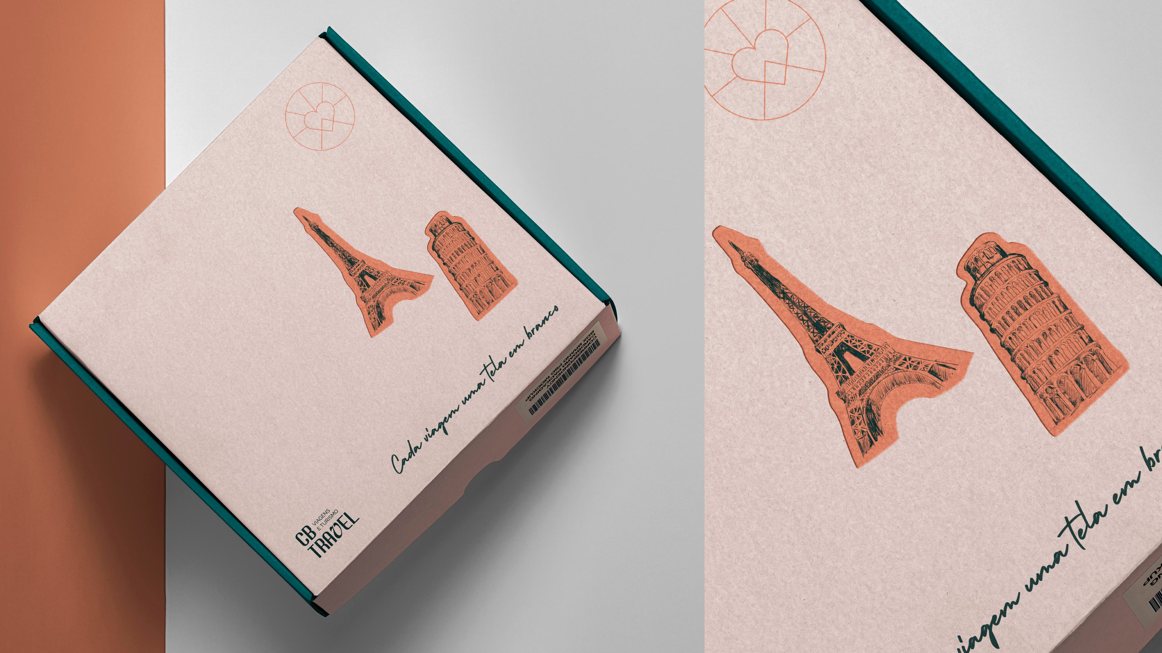
"Each trip a blank canvas", welcome box with stickers.
Project: CB Travel Visual Identity
Design and Illustrations: Mariana Godoy
Year: 2023 / 2024