Glimbo
Visual identity for a craft marketplace where buying and selling handmade matters.
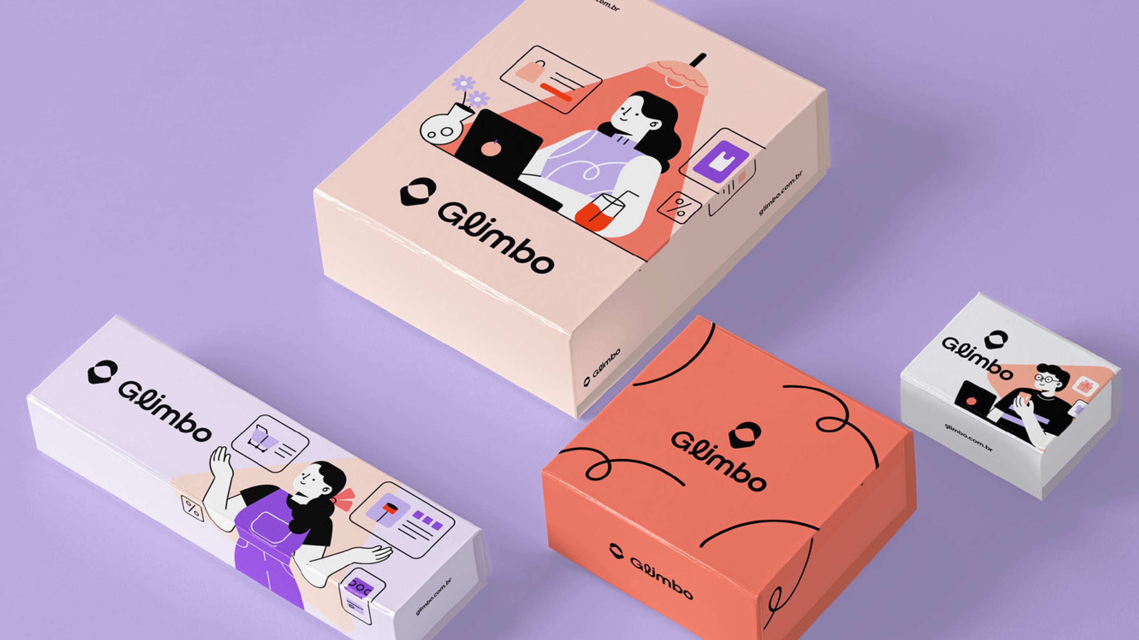
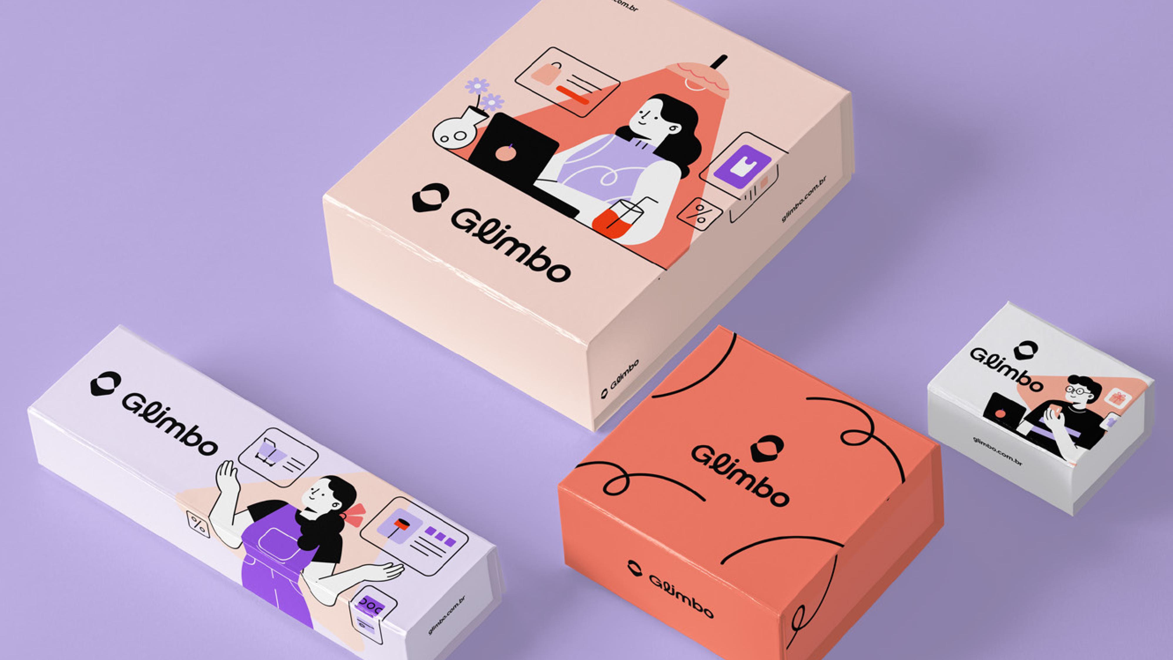
Glimbo was born with the purpose of transforming the craft ecosystem, based on the principle that buying and selling crafts matters. The challenge of this project was to translate a complex value proposition, involving co-creation, intelligence, and sustainability, into a visual identity that was both creative and simple.
Glimbo was born as a marketplace dedicated to uniting two vibrant worlds: traditional craftsmanship and the innovation of digital arts. The platform was conceived to be the meeting point between retailers and customers who value “handmade,” whether physical or digital. The challenge of this project was to create a visual identity that balanced this duality, positioning the brand in a niche occupied by large players.
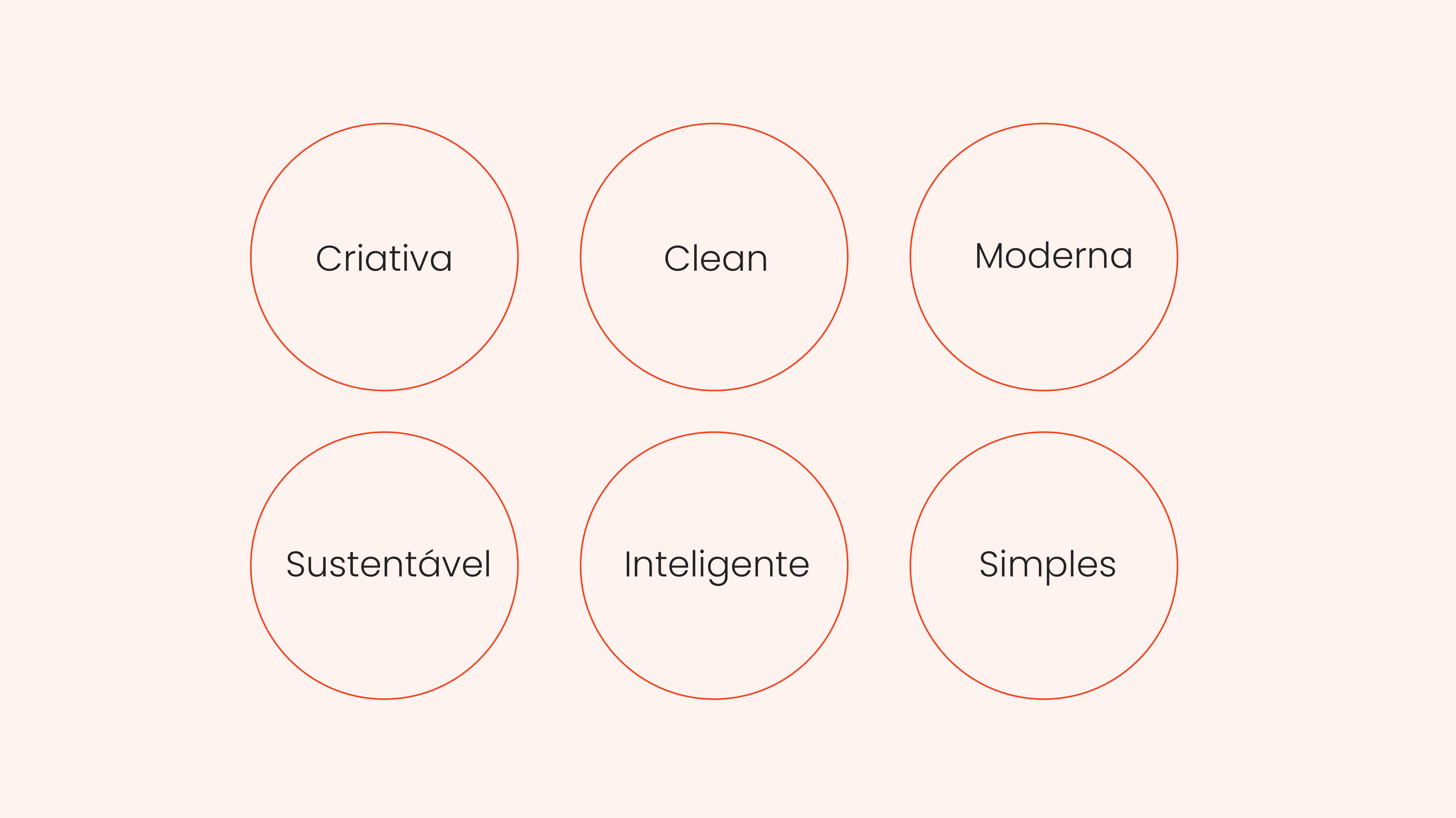
Creative, clean, modern, sustainable, intelligent, simple
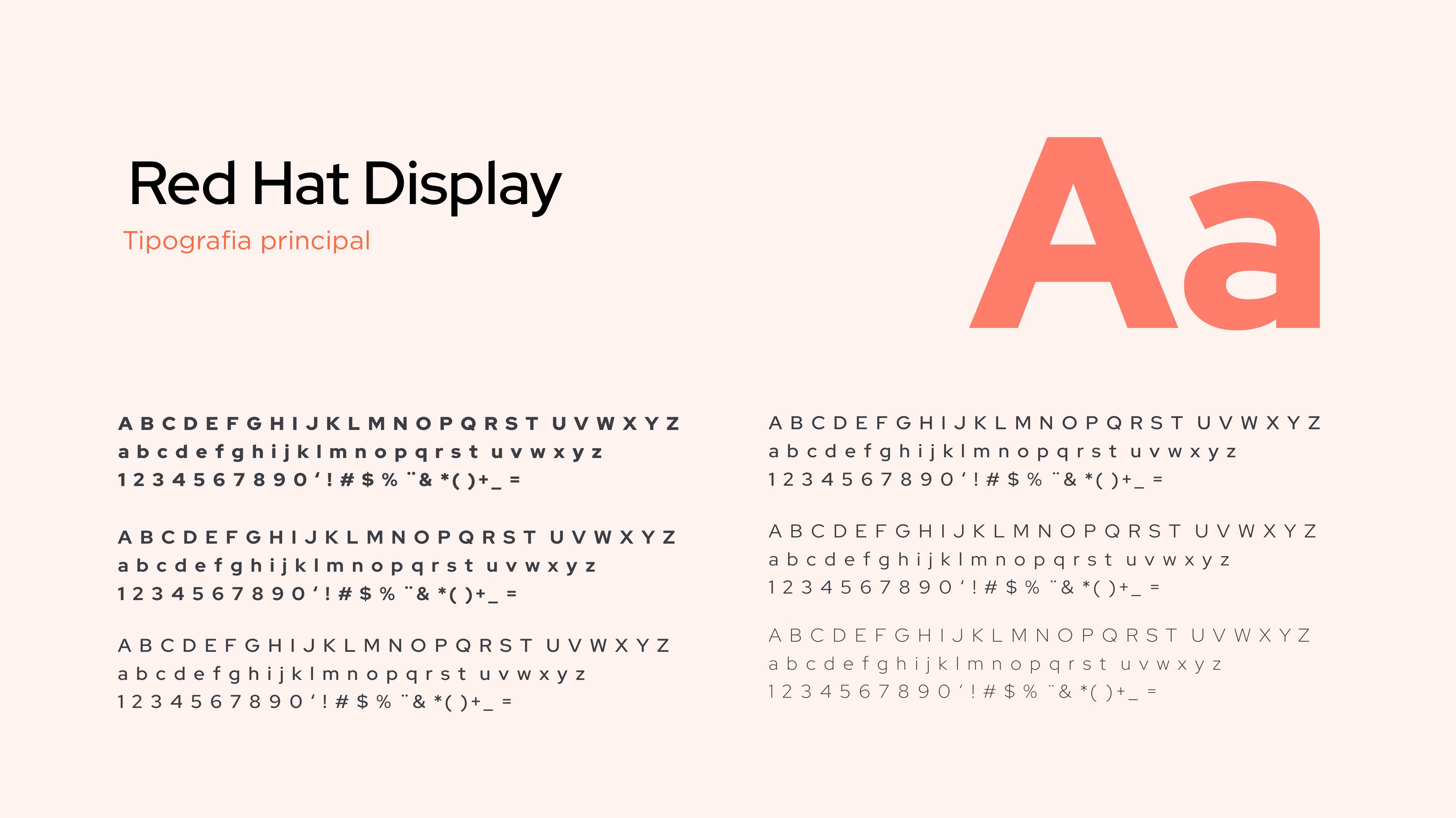
The brand was built on pillars that evoke a playful, youthful, and modern experience. We sought to translate the intelligence of a technological platform without losing the simplicity and joy inherent in the creative act. The goal is to convey a feeling of warmth and vitality, fundamental characteristics for an ecosystem that pulsates with art and craft.
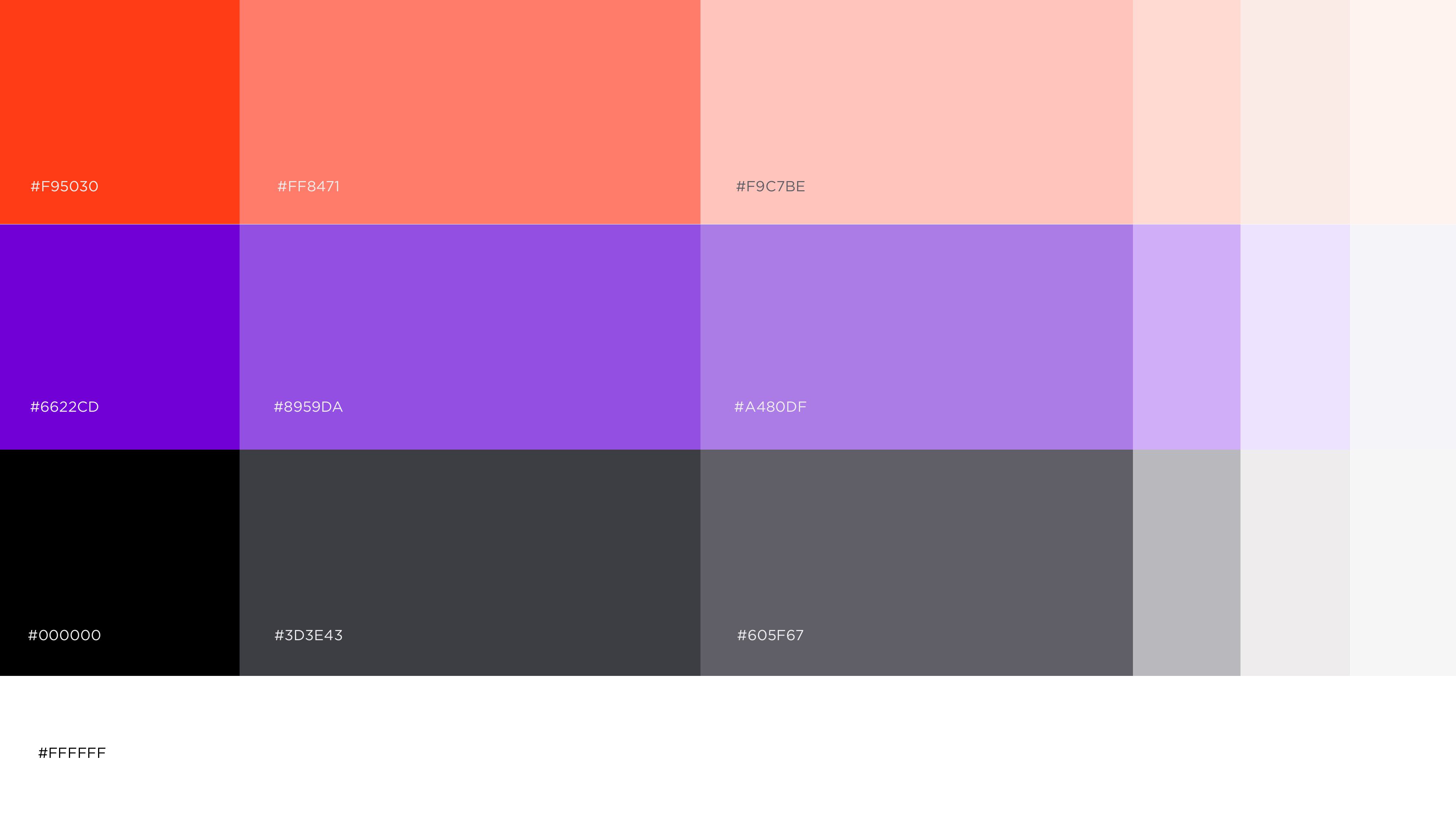
For the logo development, we prioritized simple and direct typography, ensuring legibility and a clean aesthetic. Following the project guidelines, the identity is accompanied by a proprietary symbol, an essential element for brand memorability in digital environments. The color palette was strategically chosen to represent the balance between the freshness of technology and the expressiveness of art.
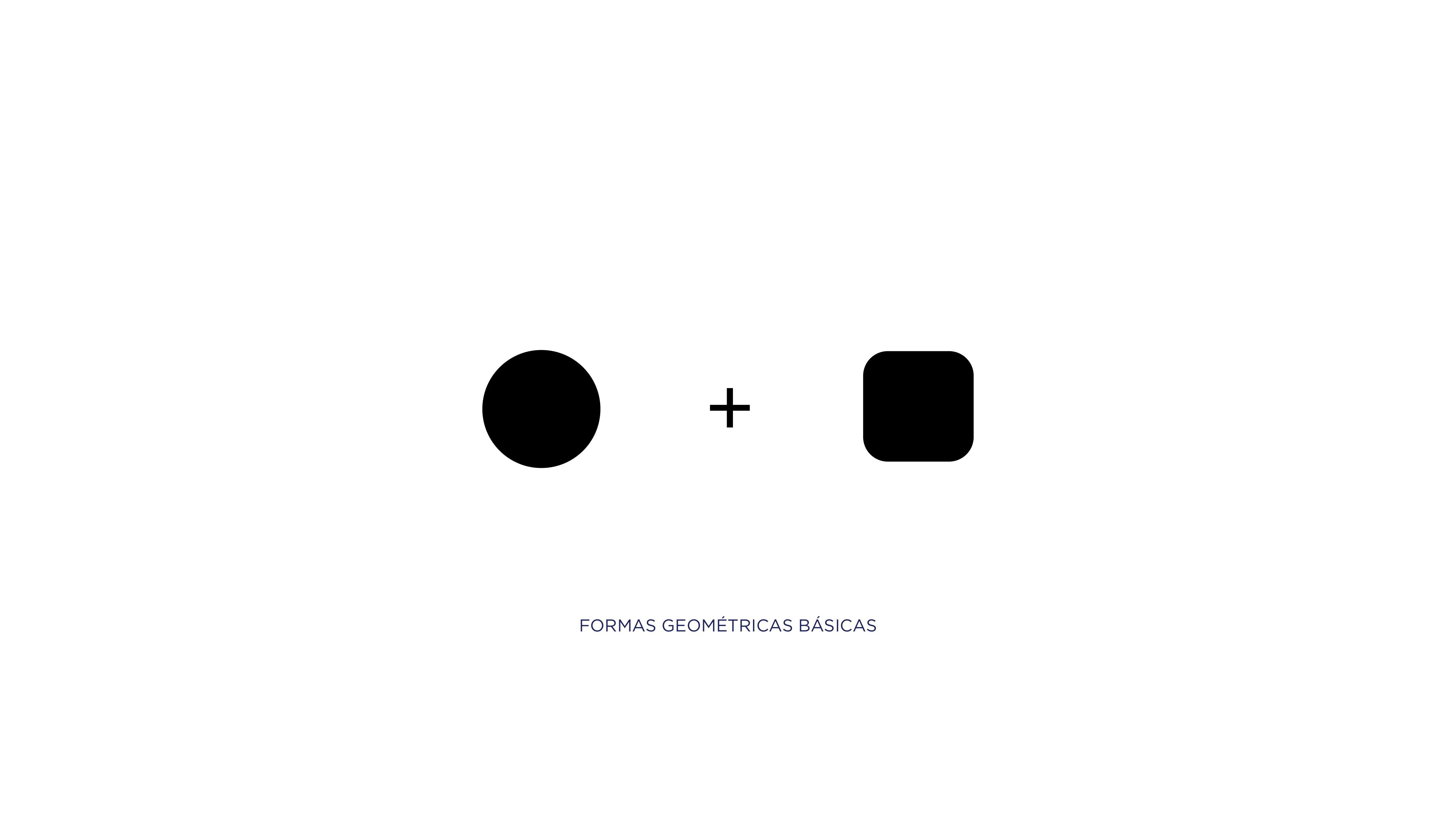
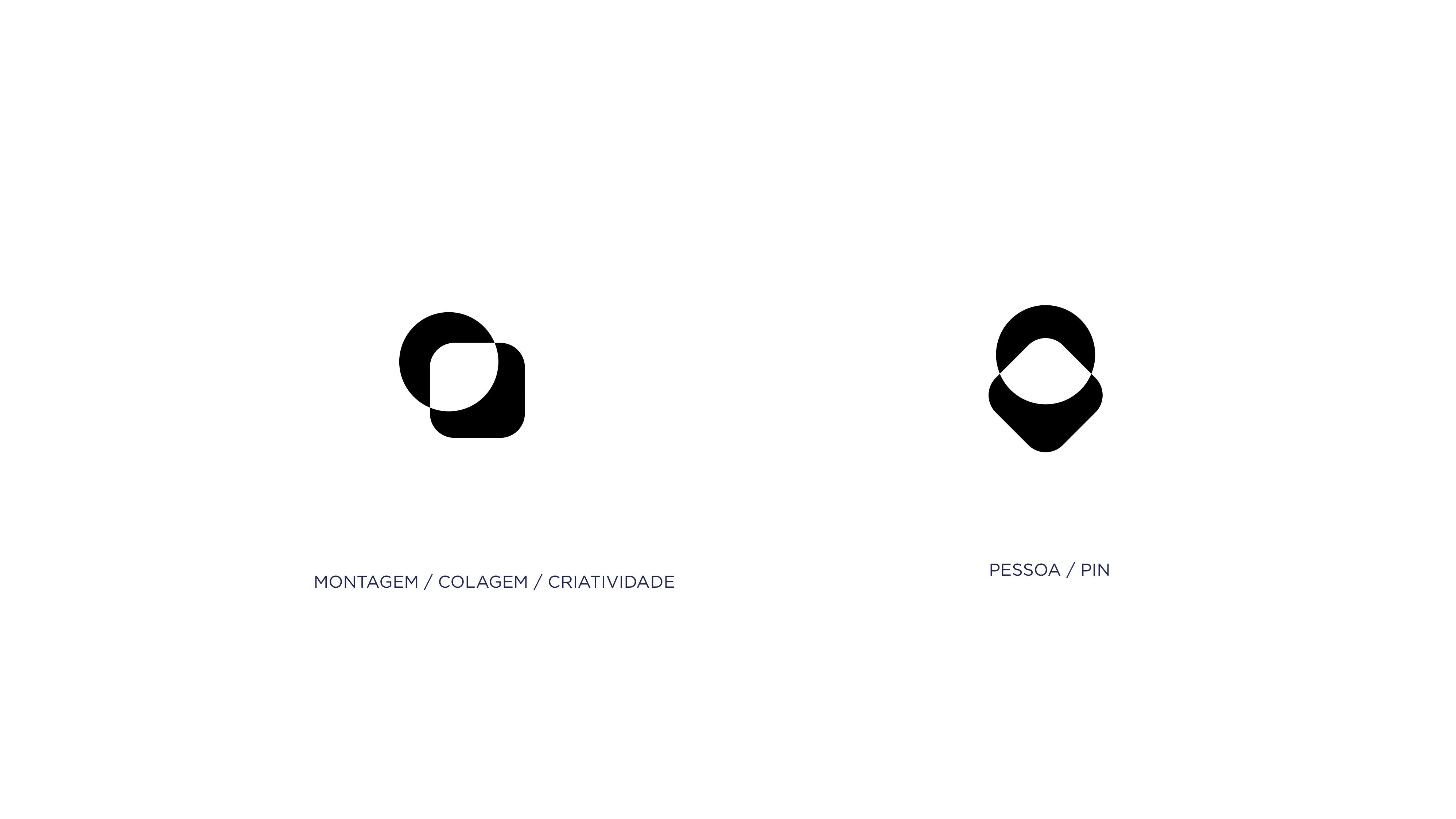
The brand was built on the pillar of visual intelligence and modernity. The symbol uses a combination of basic geometric shapes to represent two fundamental elements:
Person / Pin: Symbolizing the community of artisans and the meeting point in the marketplace.
Assembly and Creativity: Reflecting the manual process, the collage, and the essence of “making” that defines craftsmanship.

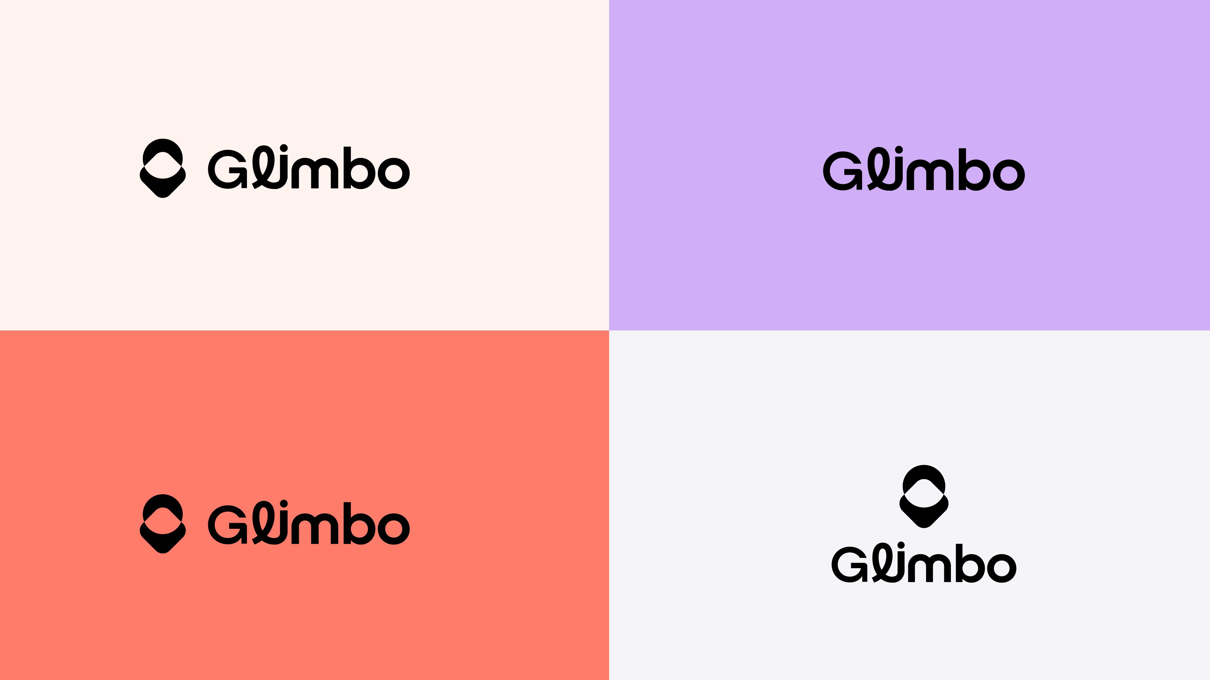
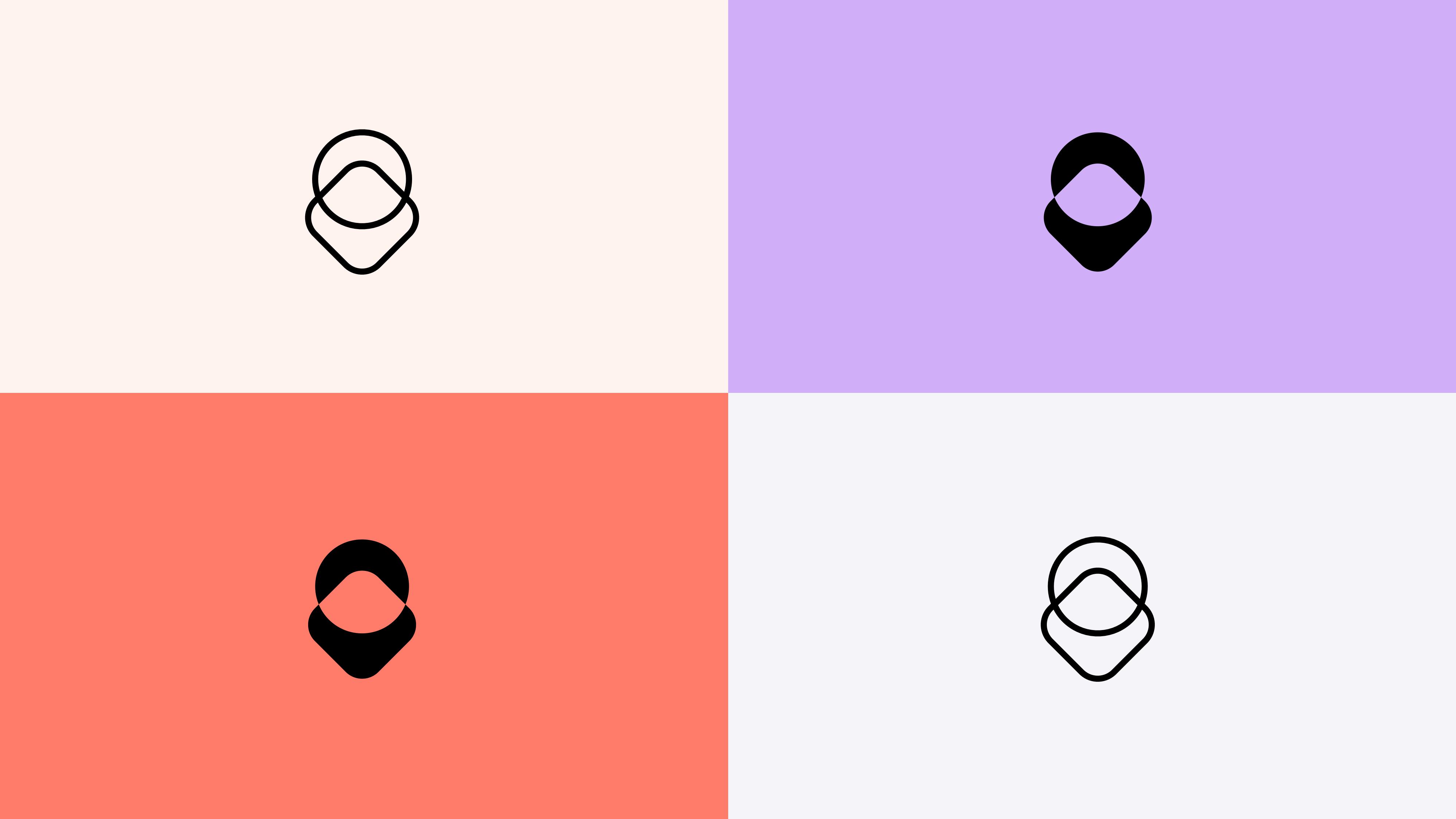
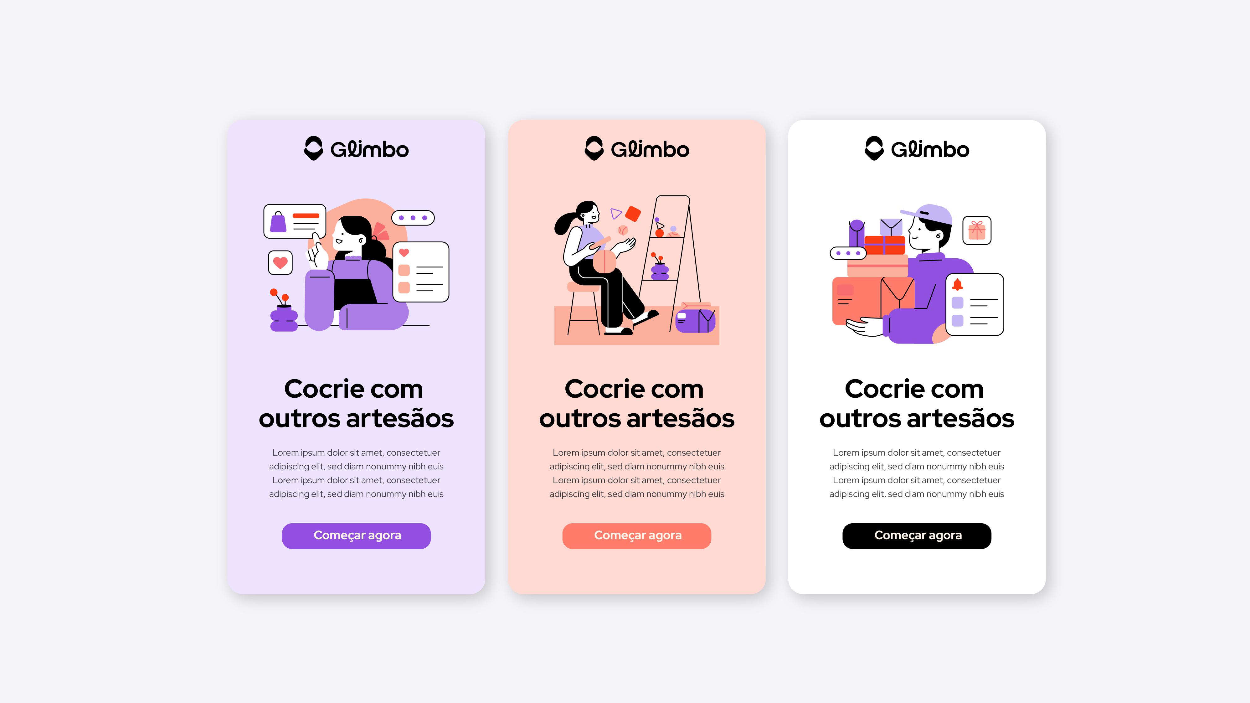
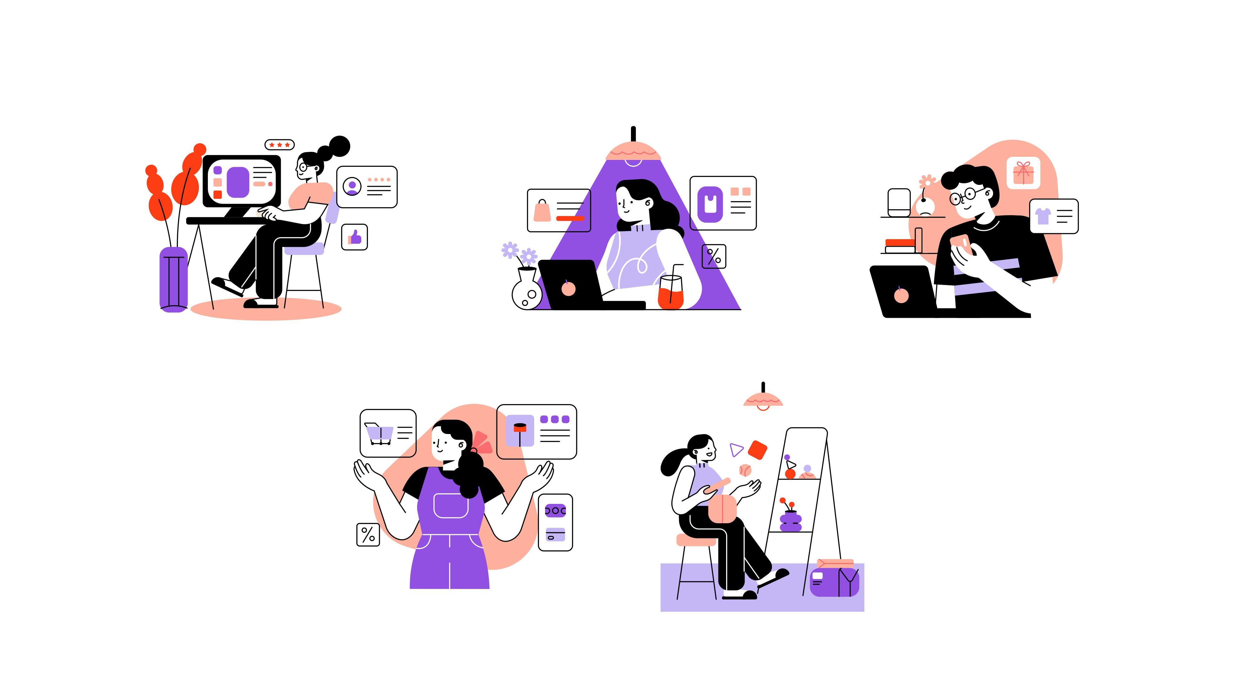
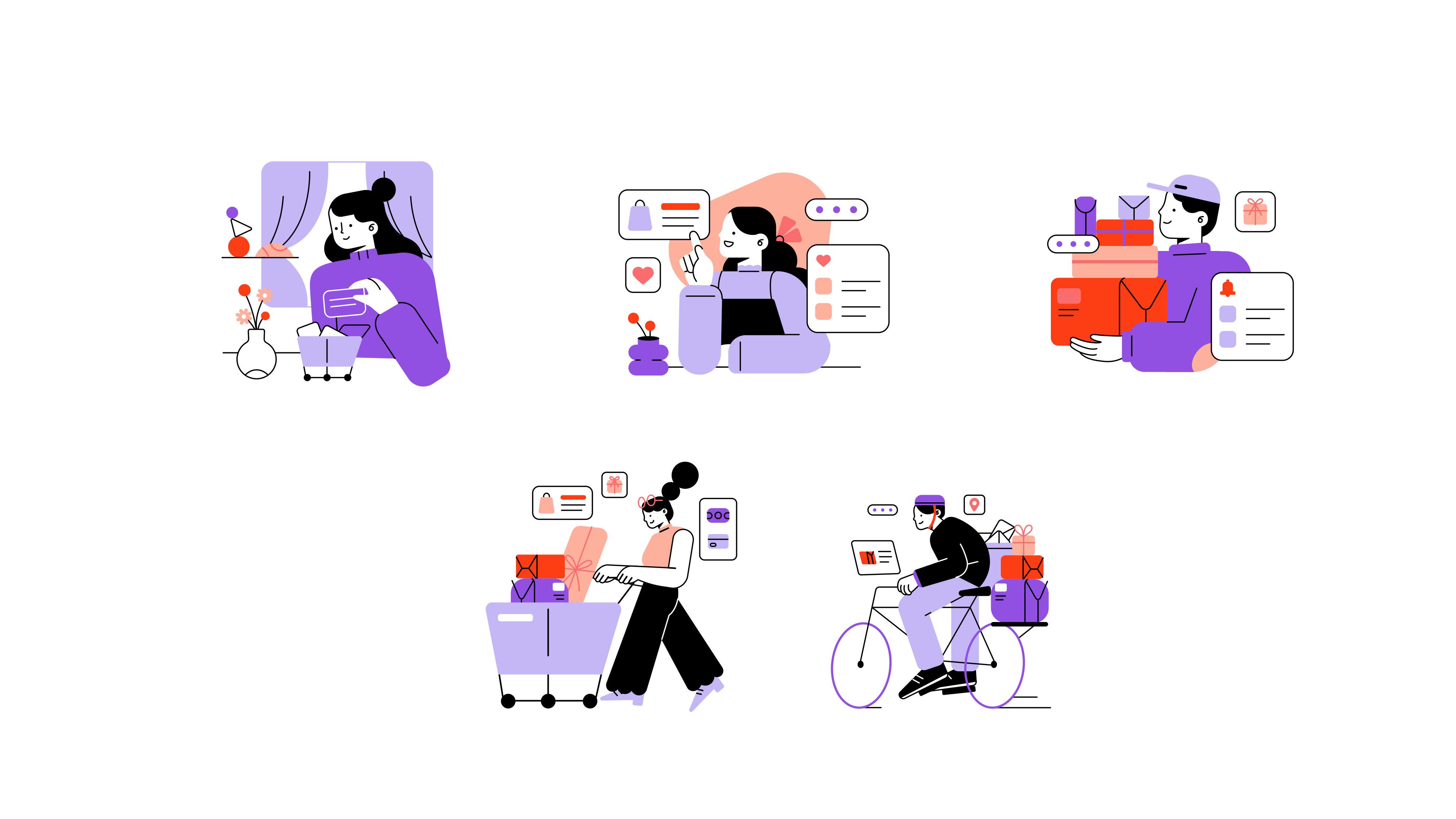
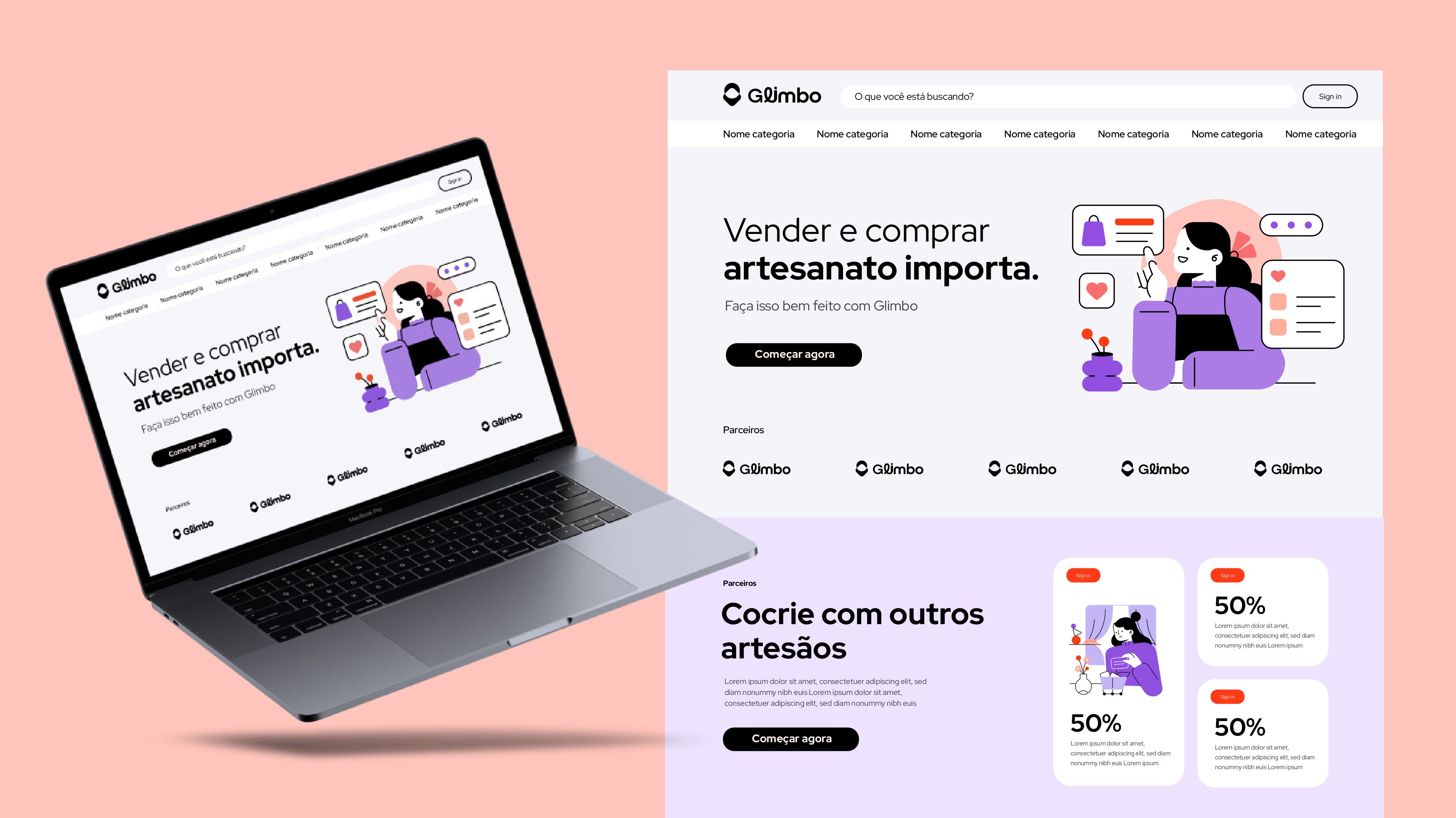
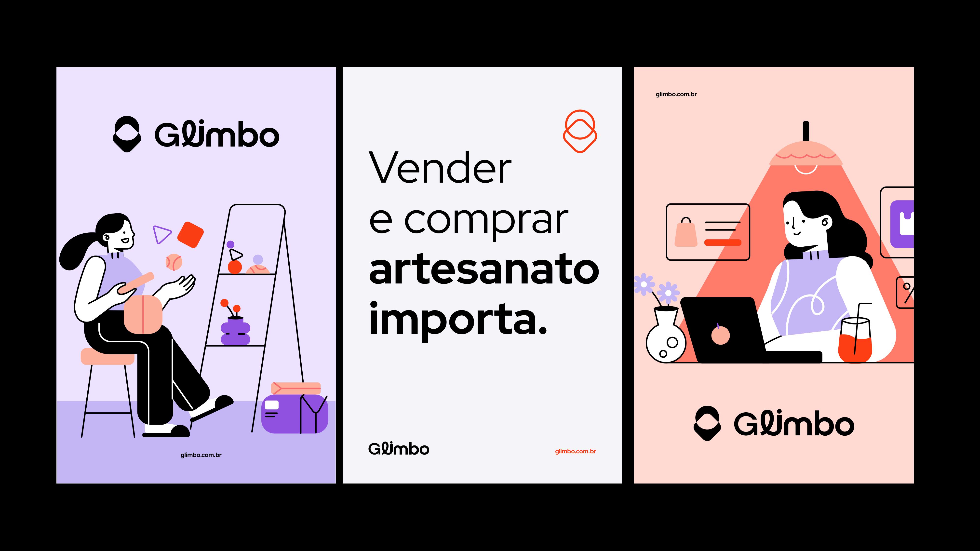
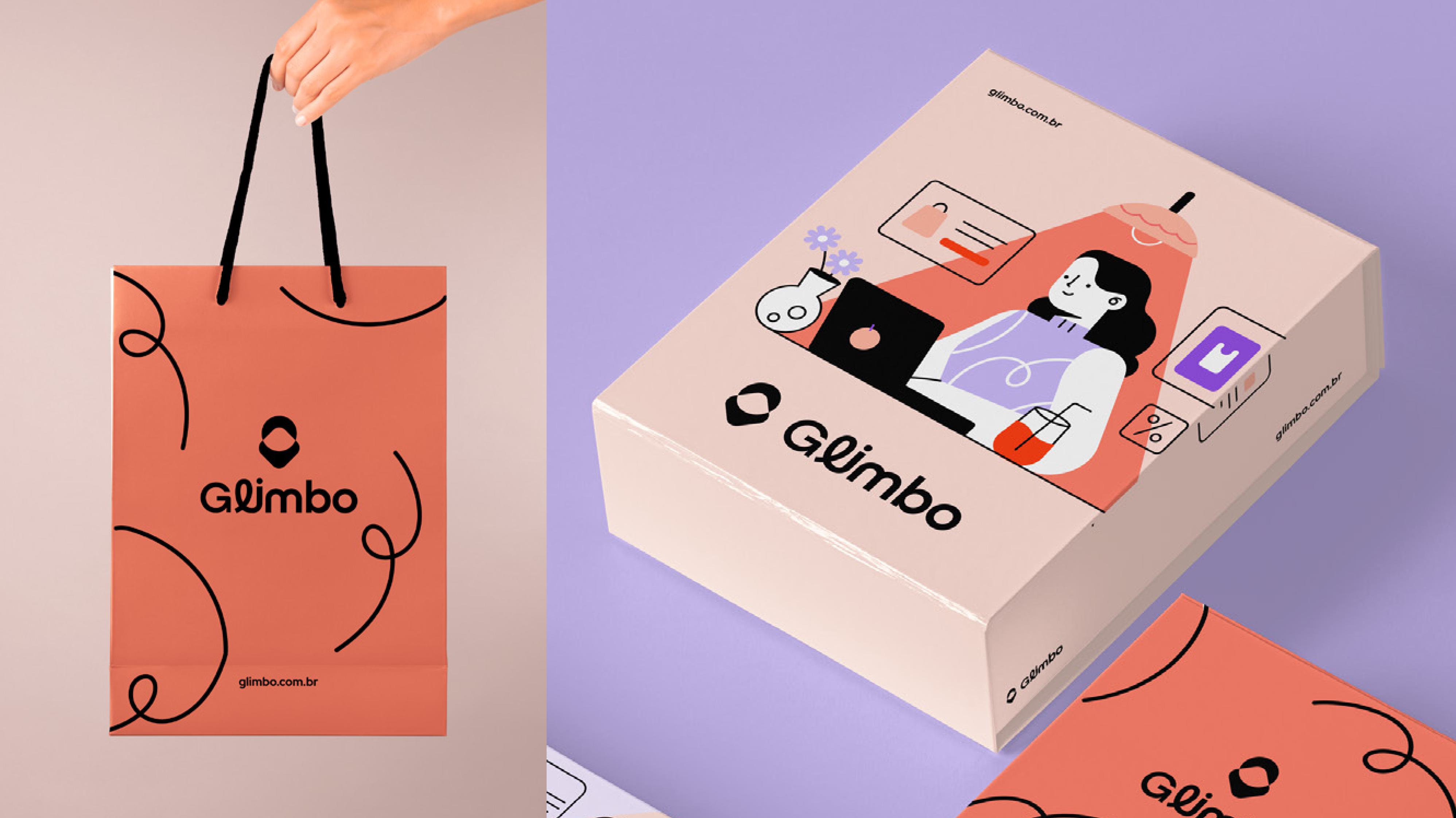
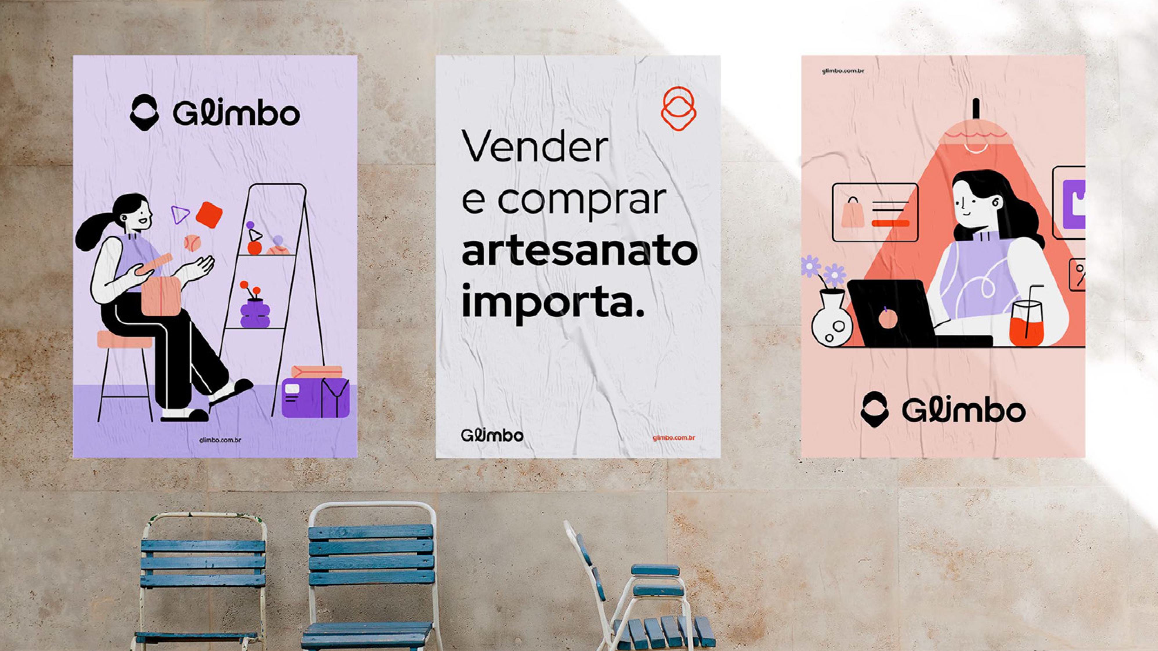
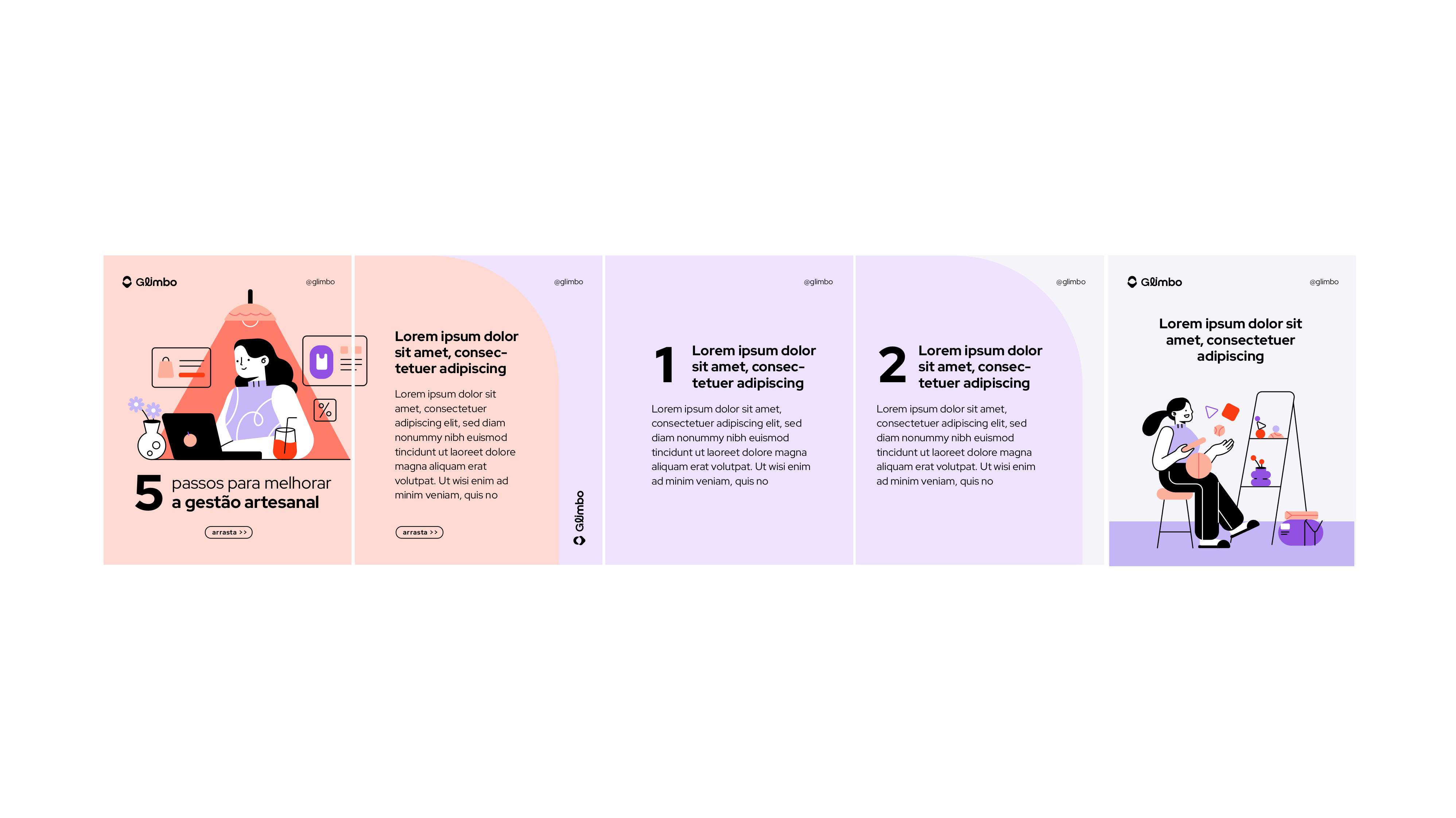
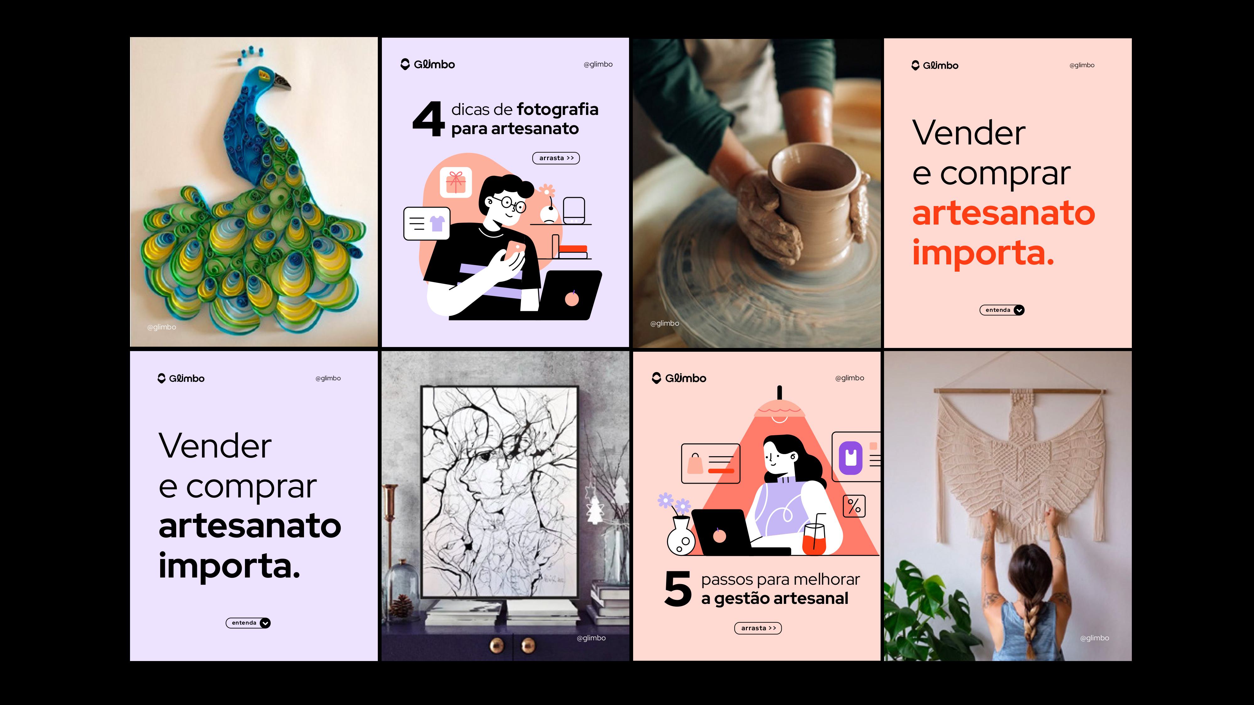
The inspiration for the visual design came from contemporary aesthetics that utilize organic forms and modular compositions. The focus was on creating a visual language that not only presented the marketplace but also celebrated the creative community that comprises it, allowing the brand to be as diverse as the products sold on it. The dynamic and creative illustrations also reinforce this spirit of creativity and joy.
Project: Glimbo Visual Identity
Design and Art Direction: Mariana Godoy
Year: 2024 / 2025