Fractree
Visual identity for an electronic music project on the border between logic and emotion.

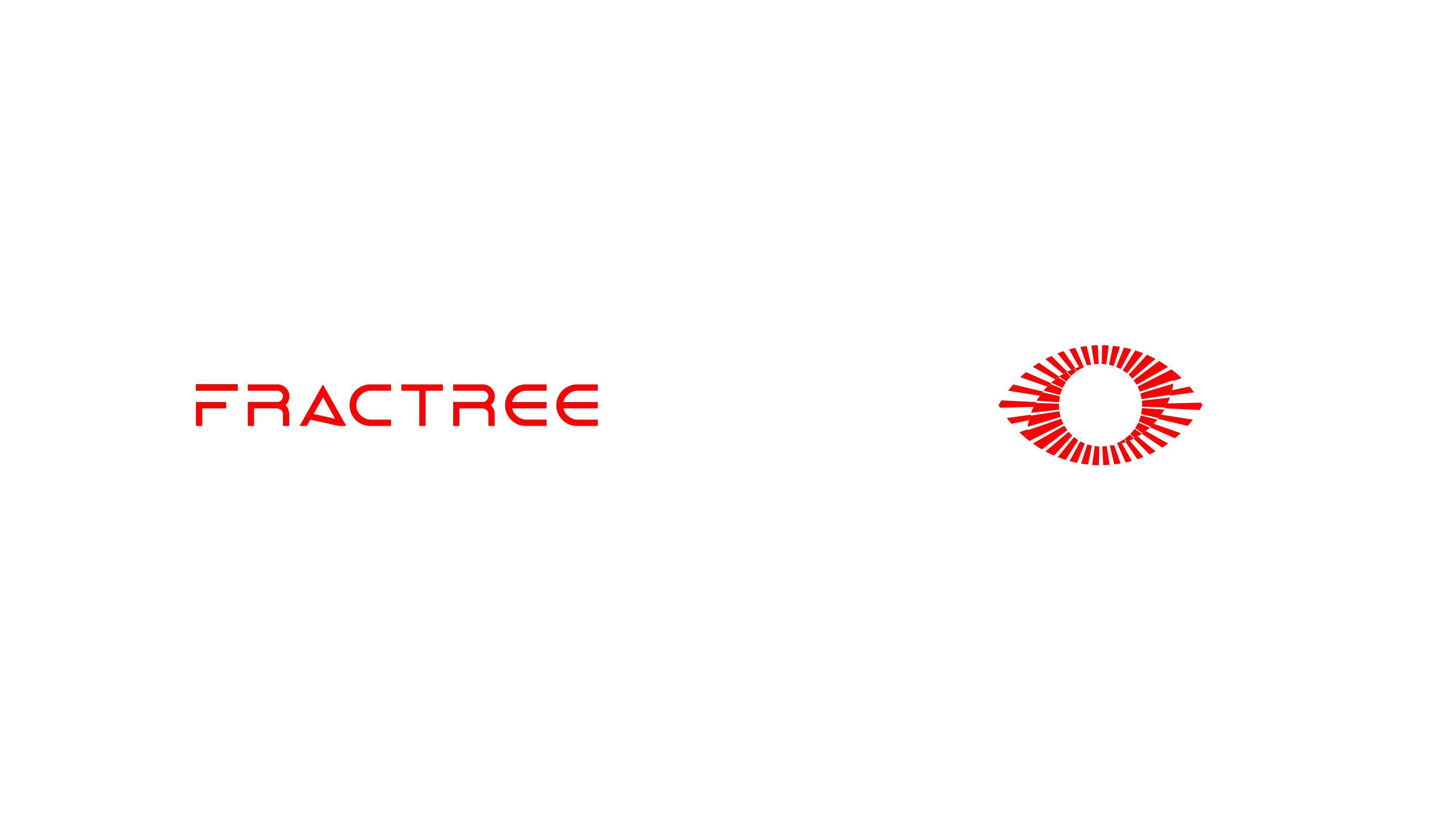
FRACTREE is not just an electronic music project; it's an artistic exploration that inhabits the border between logic and emotion.
The name is born from the fusion of two worlds: the mathematical rigor of fractals (frac) and the organic vitality of the tree (tree). This visual identity was developed to reflect this dynamic interaction, representing a journey of consciousness, existence, and transformation through Trance and Psytrance.
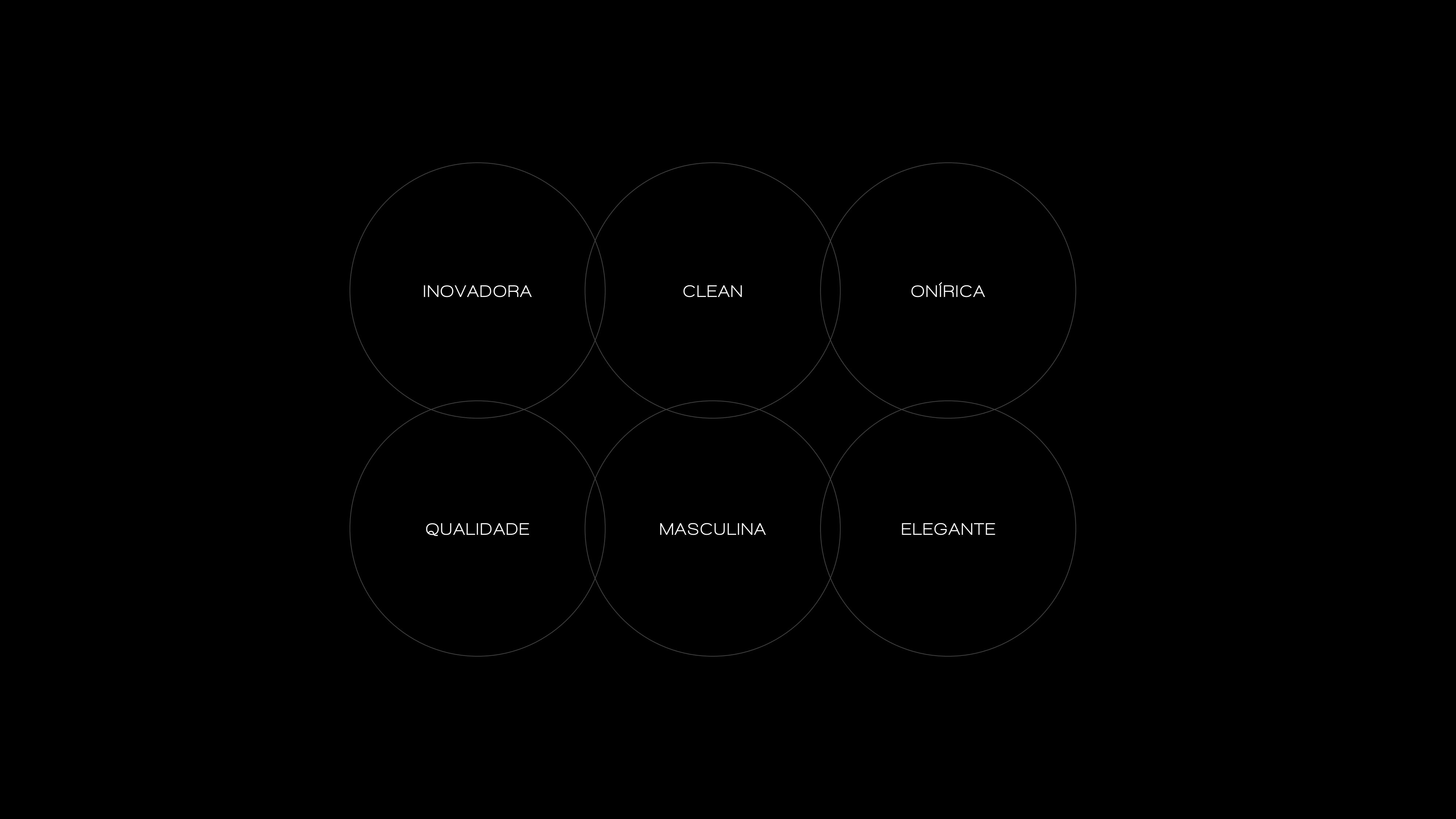
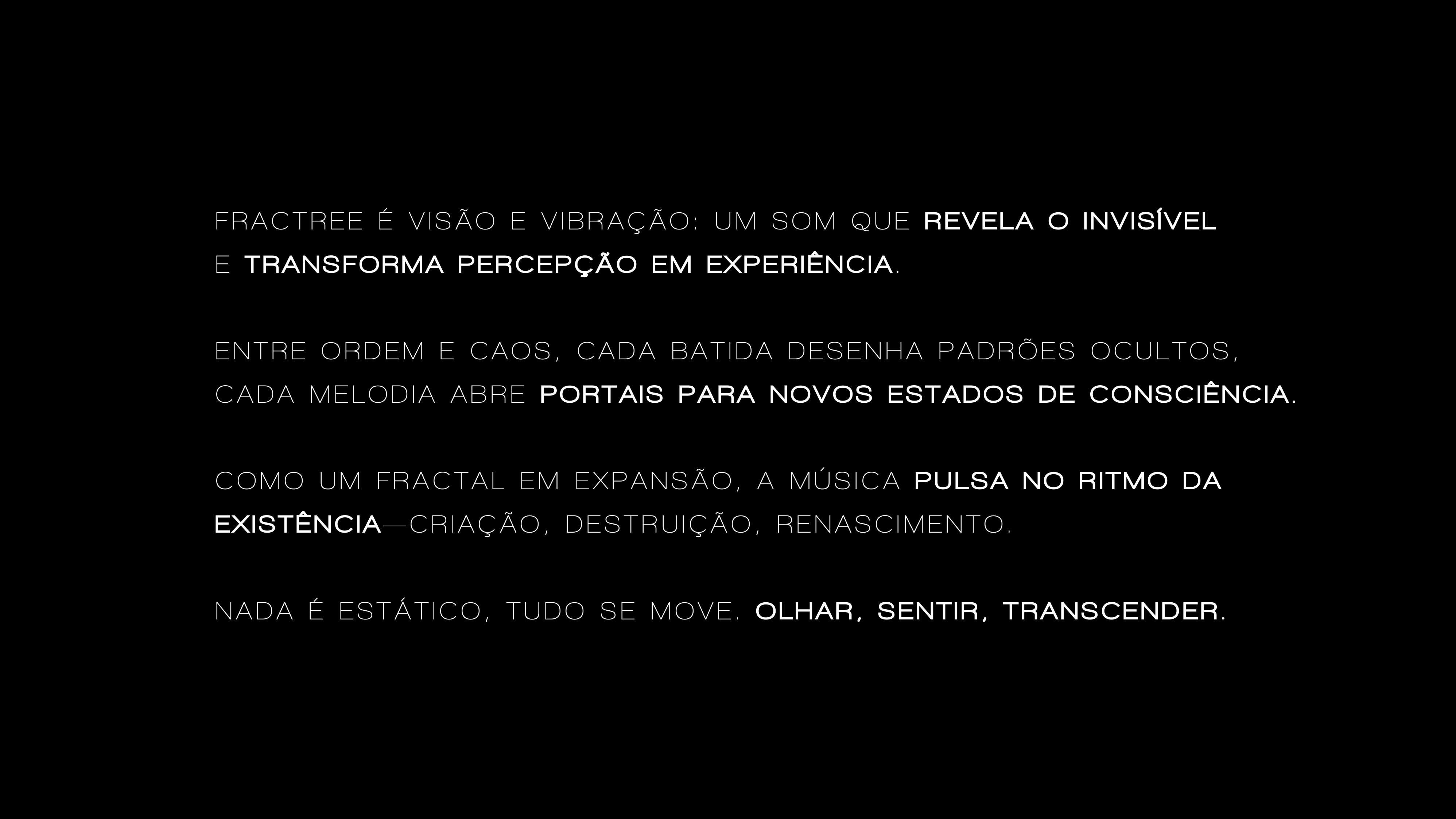
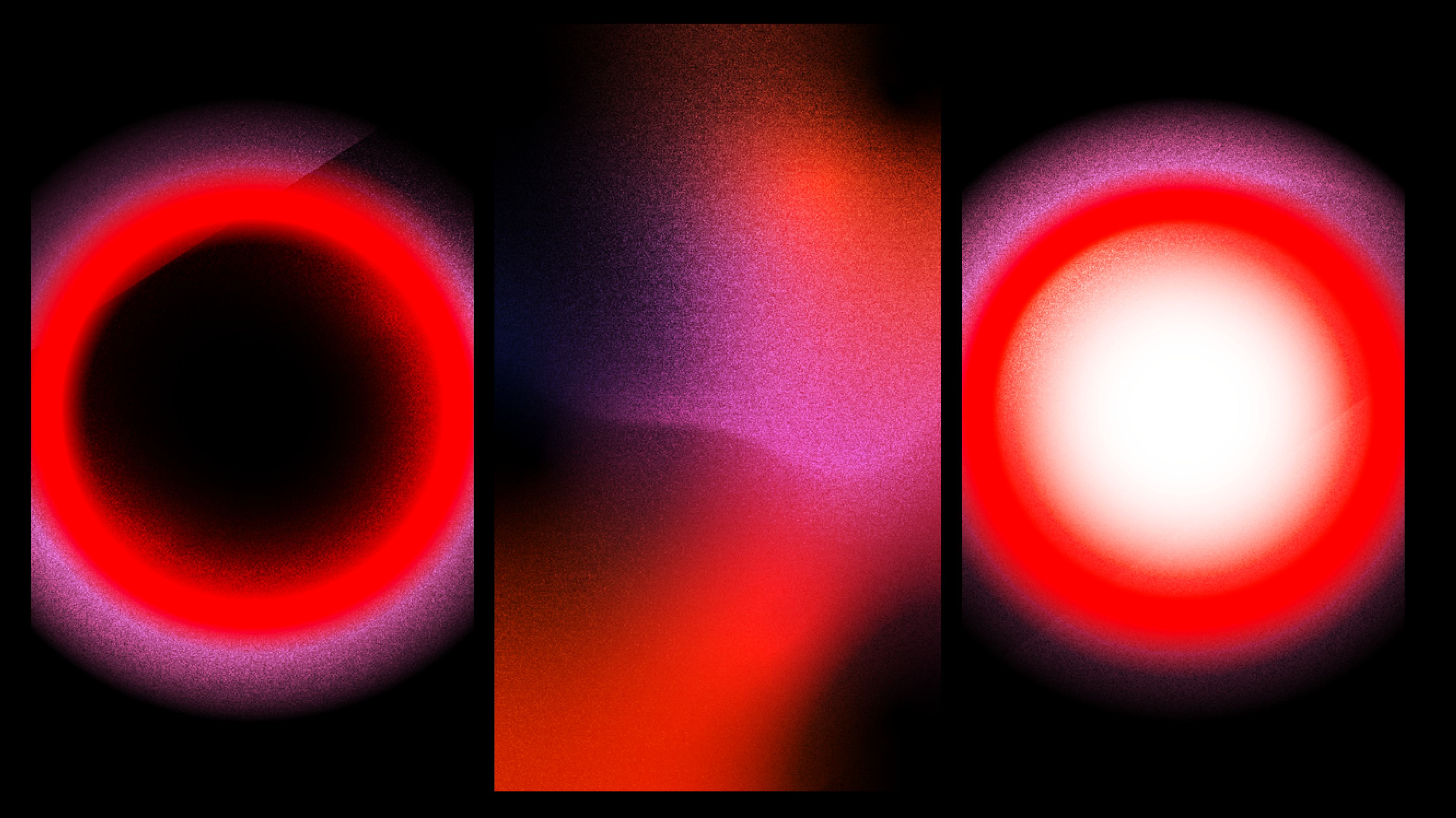
Based on Carl Jung's philosophy that "no tree reaches the sky without its roots reaching the underworld," the visual project embraces complexity. The brand seeks to express what words cannot, balancing the immutable order of the past with the chaos full of possibilities of the future. The visual identity acts as the link between the objective world and the unknown, using layers that move between the predictable and the unpredictable.

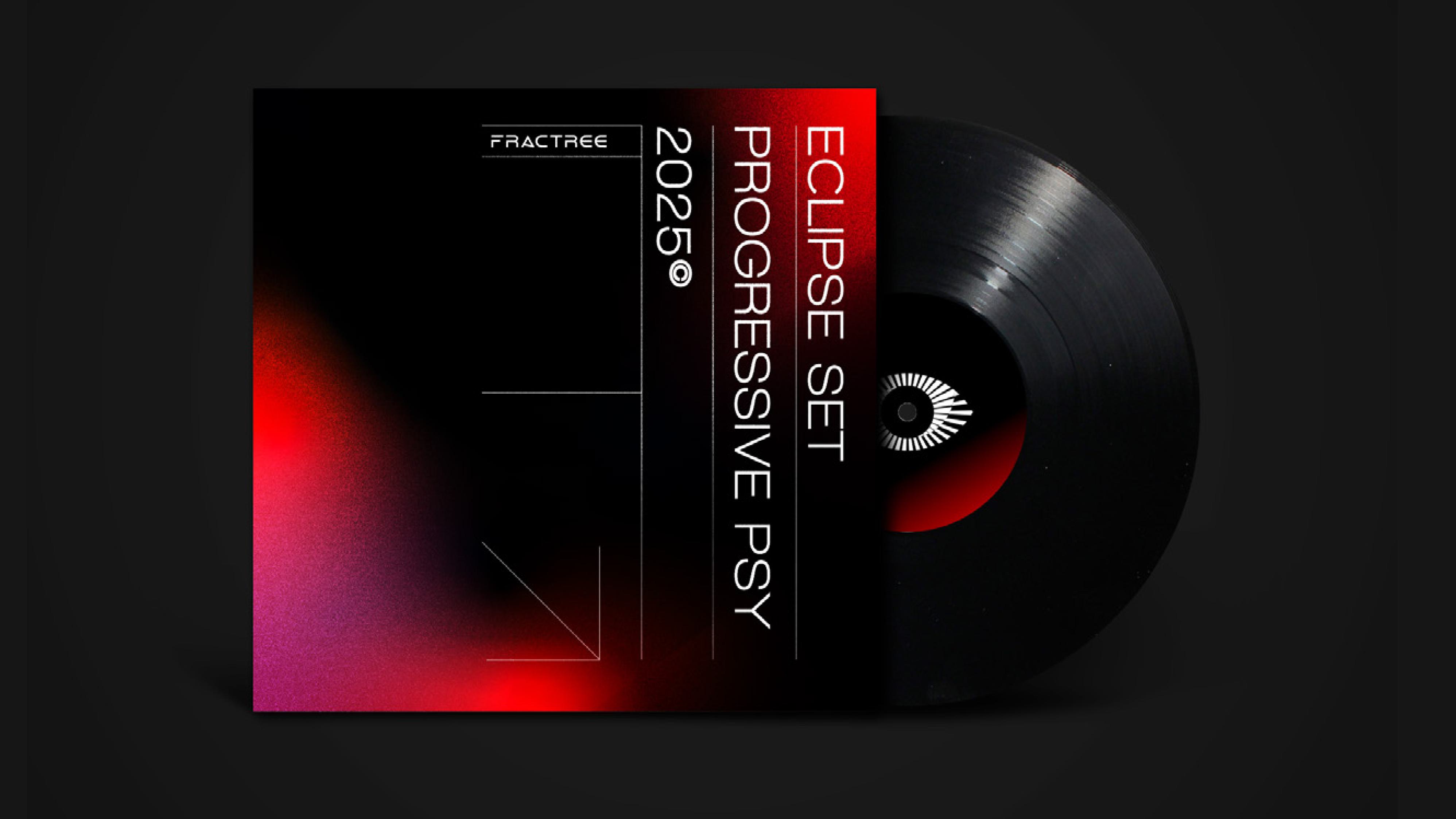
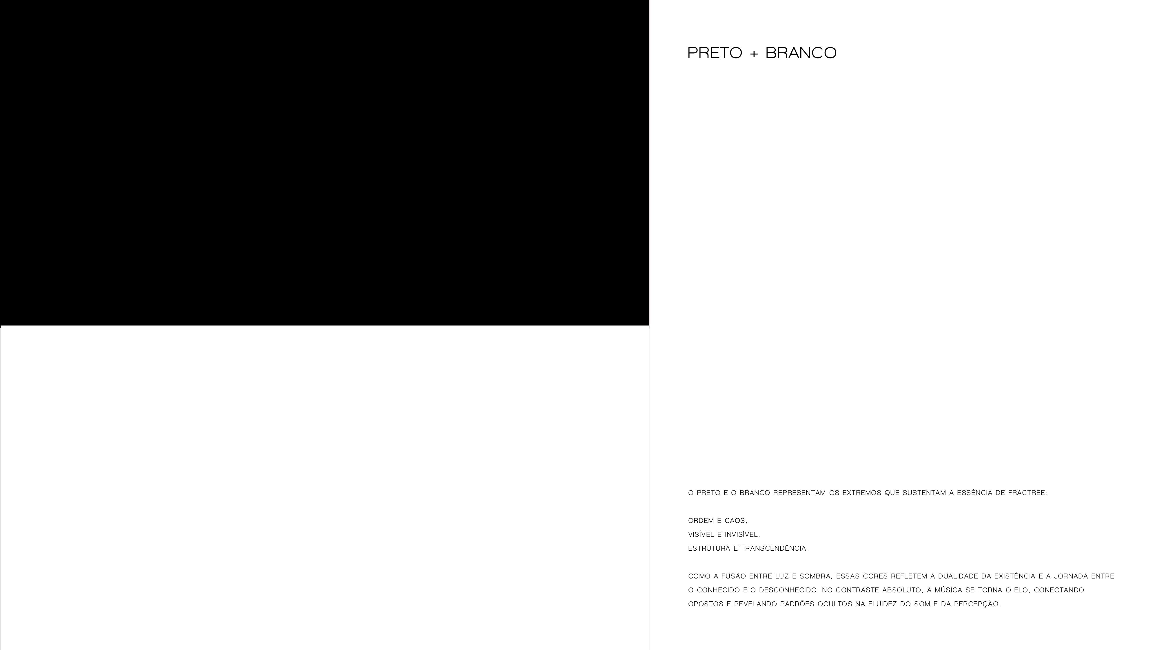
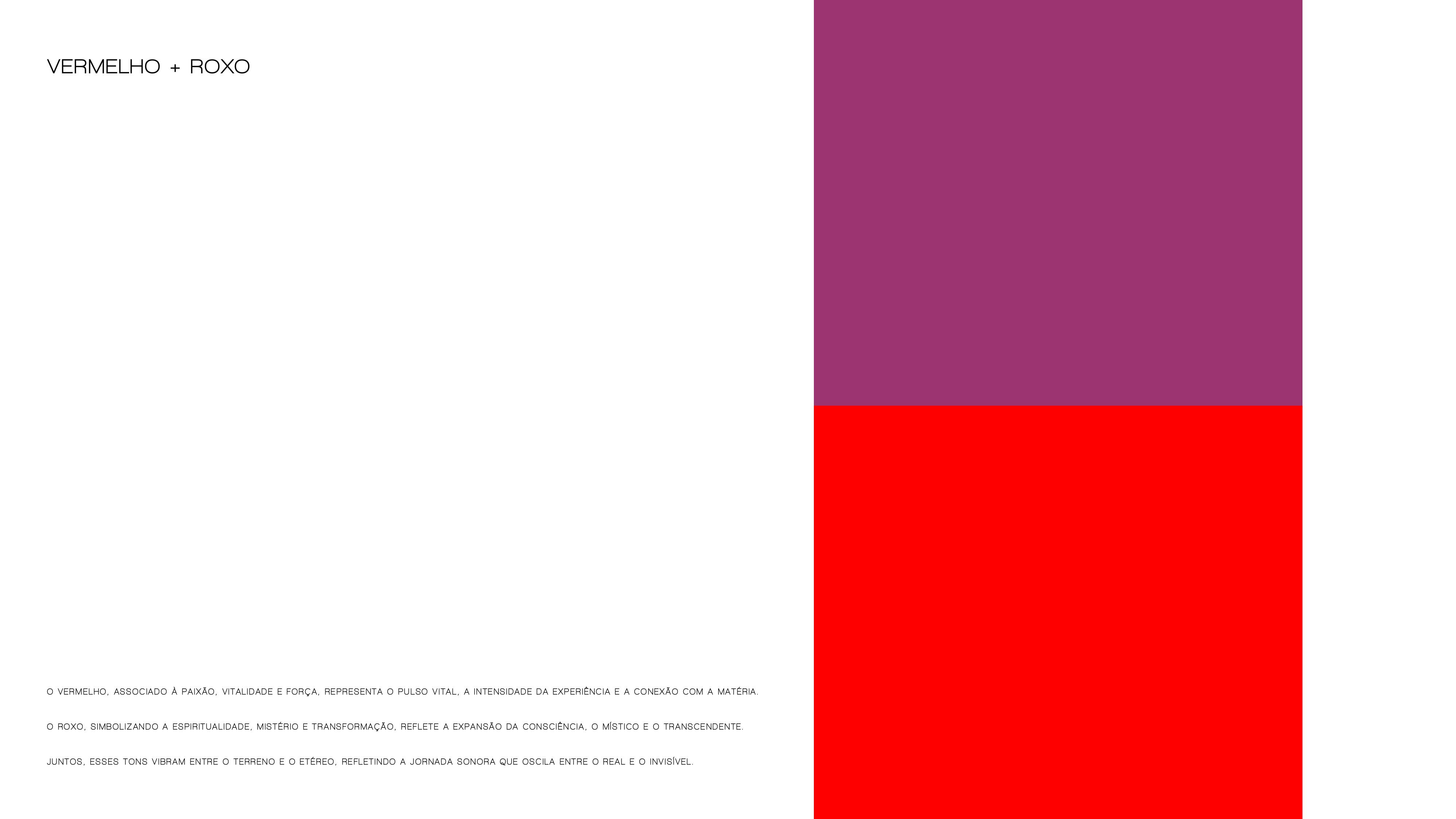
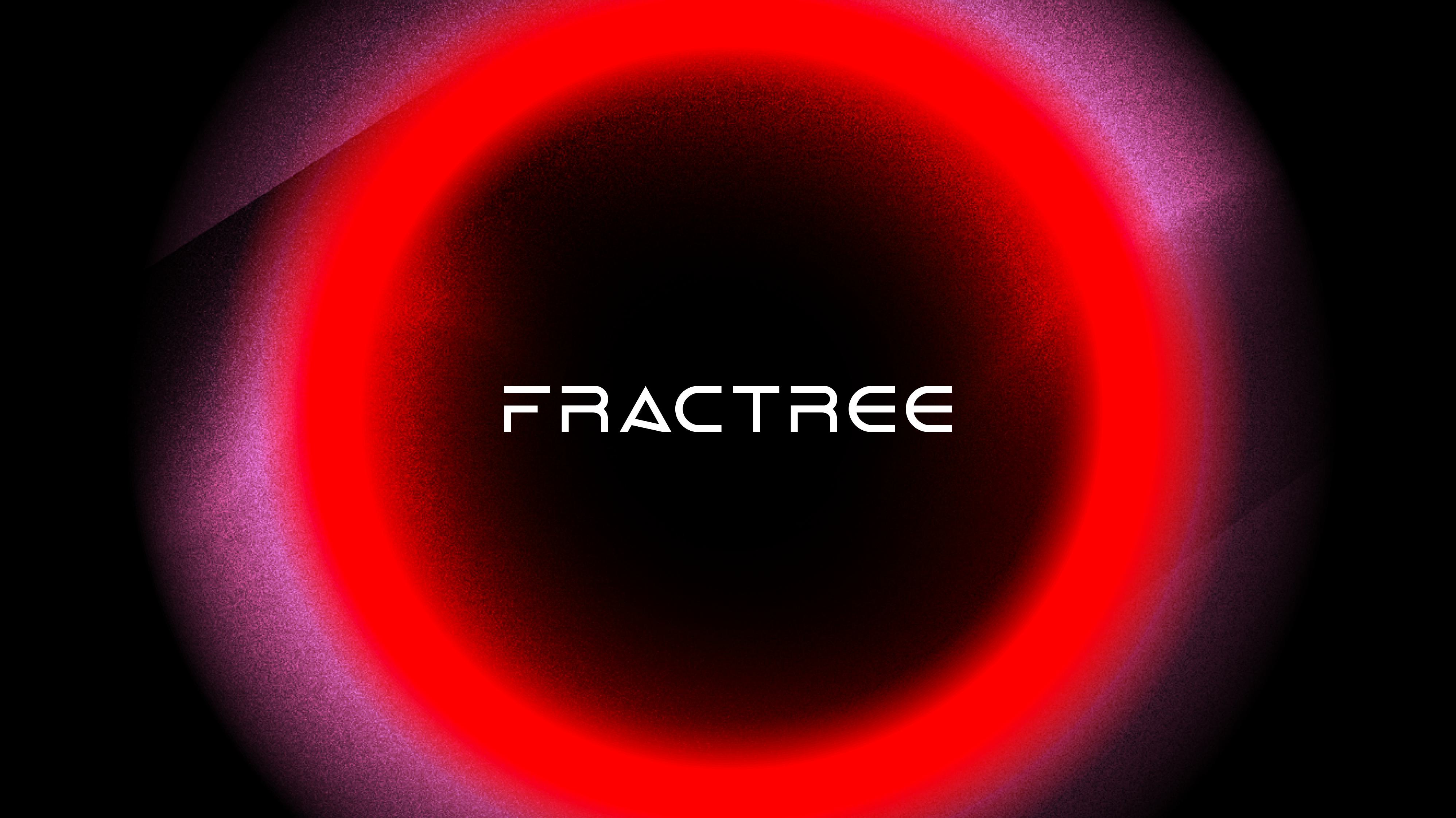
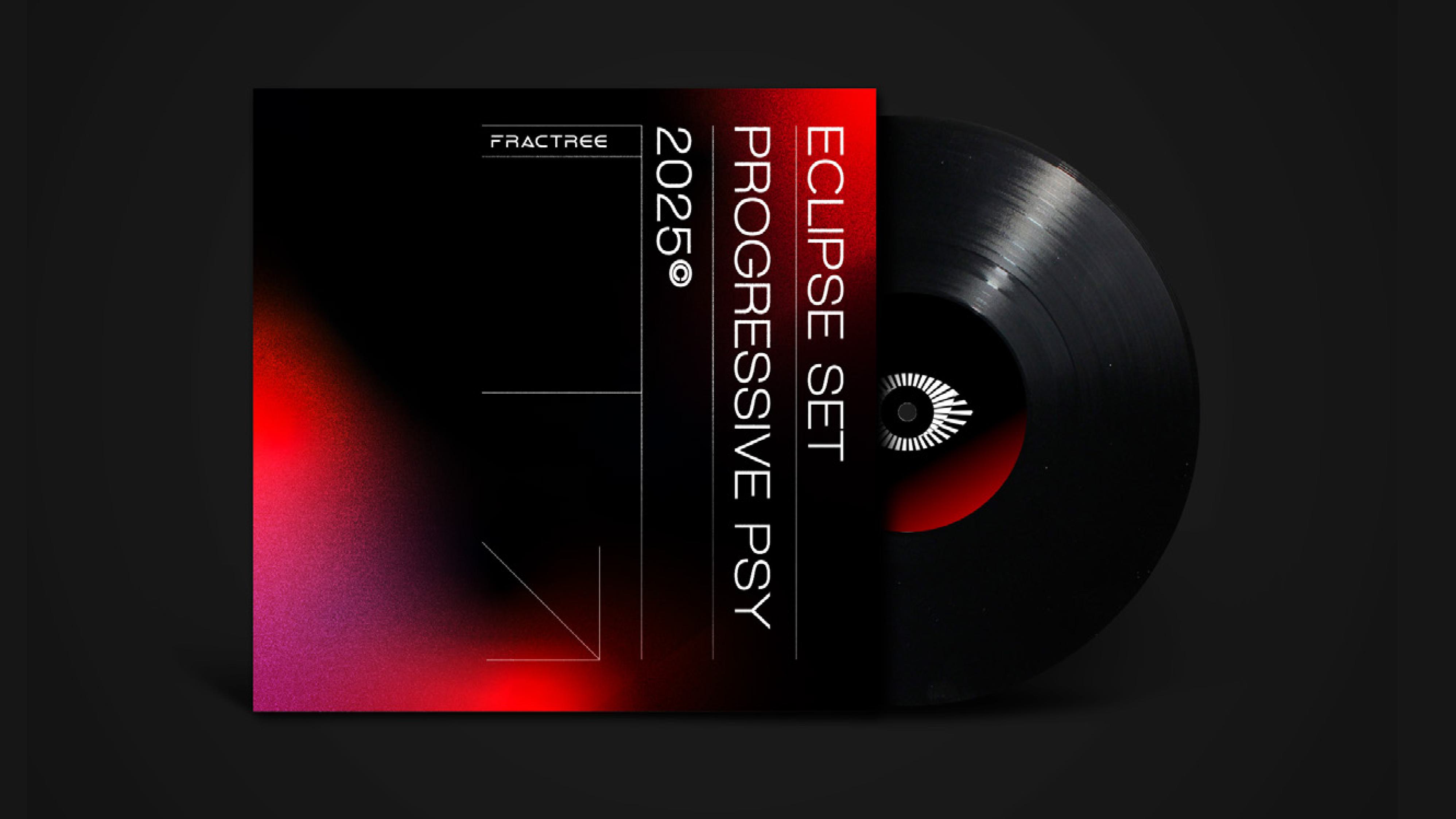
Color palette of opposites: The brand's foundation uses Black and White to support the essence of duality: order and chaos, the visible and the invisible. As a vibrant complement, Red brings vital pulse and intensity, while Purple symbolizes spirituality and the expansion of consciousness.
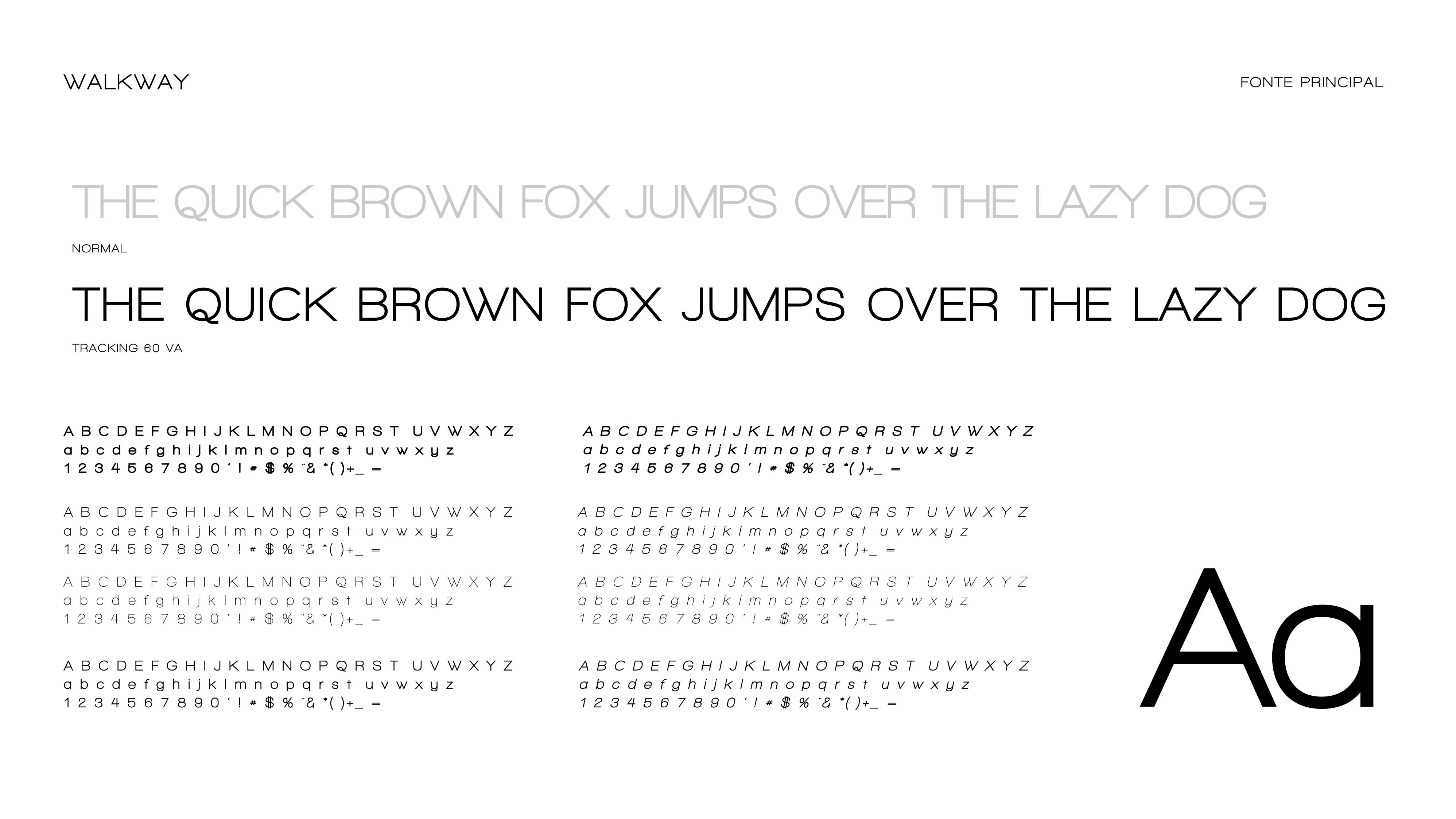
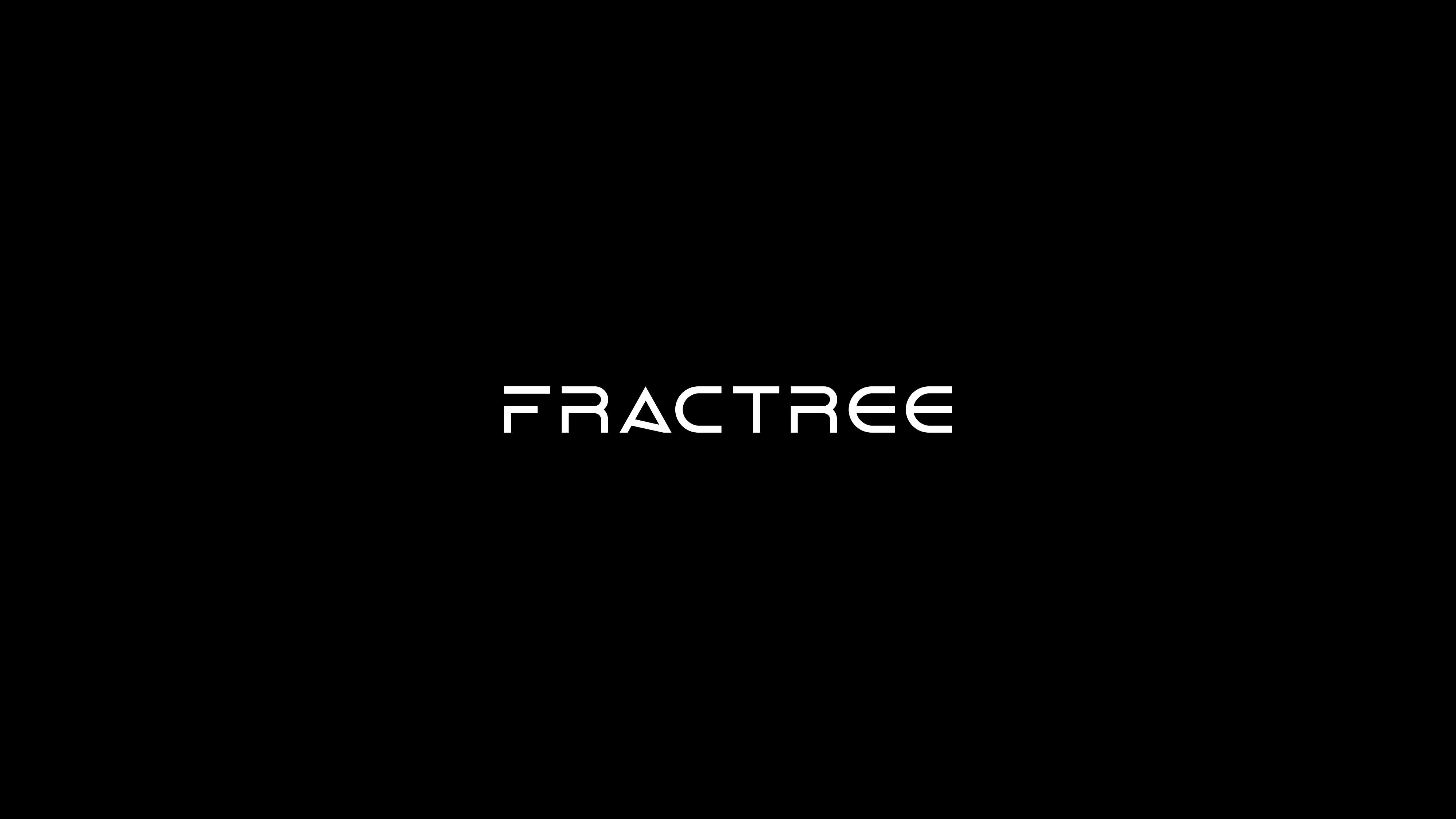
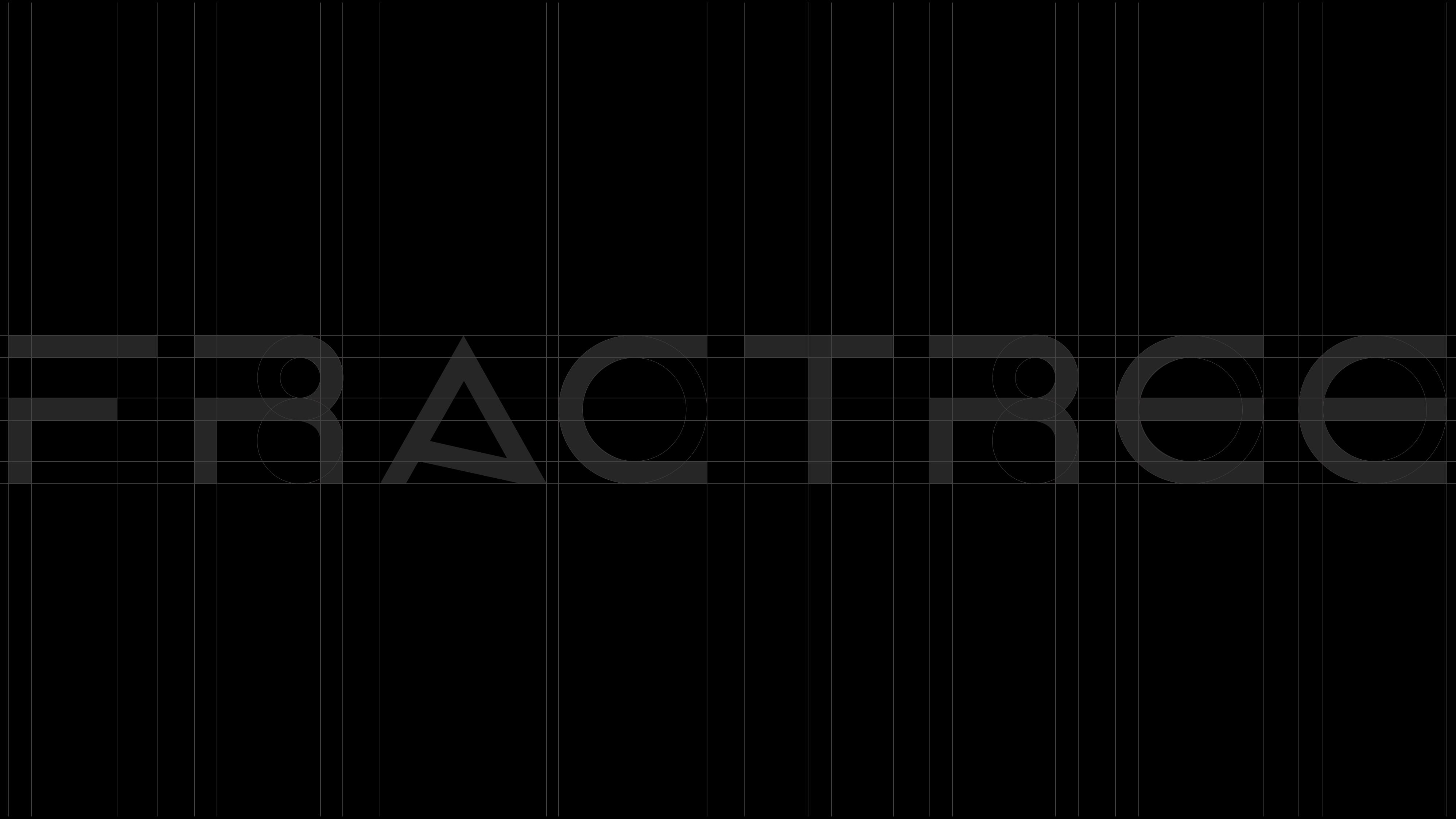
Typography: The choice of Walkway as the main font reinforces the brand's modernity and clarity, complemented by Helvetica Neue to ensure functional and timeless communication across all platforms.
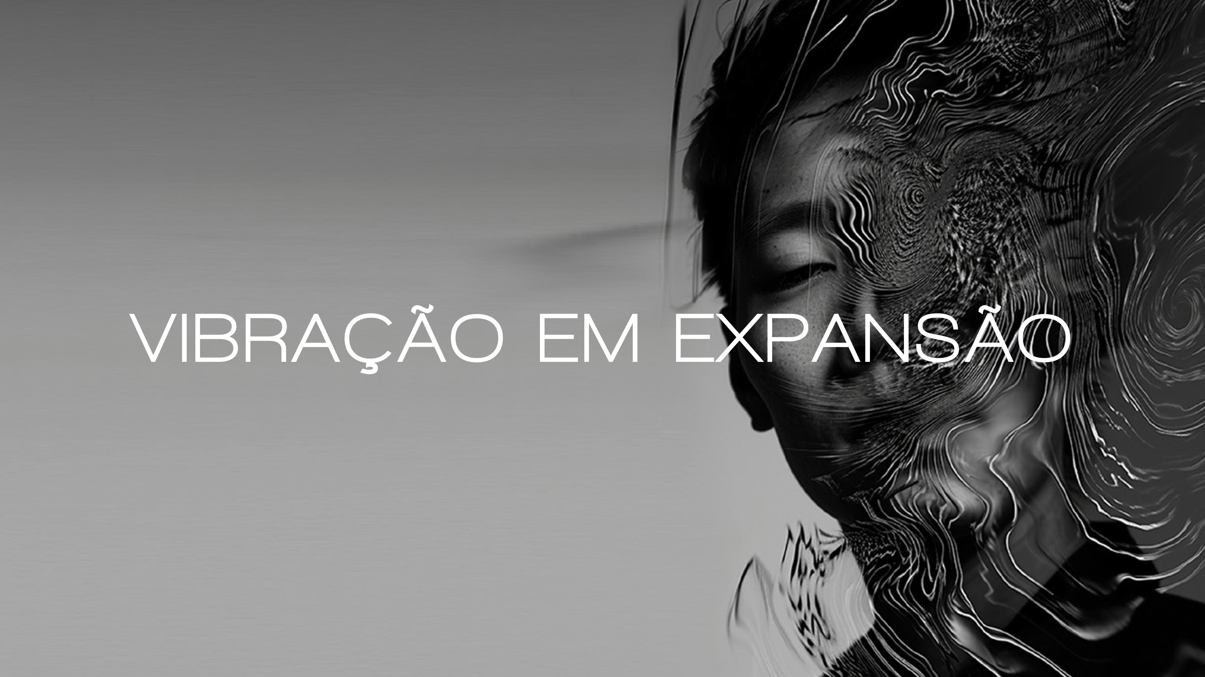
Expanding vibration
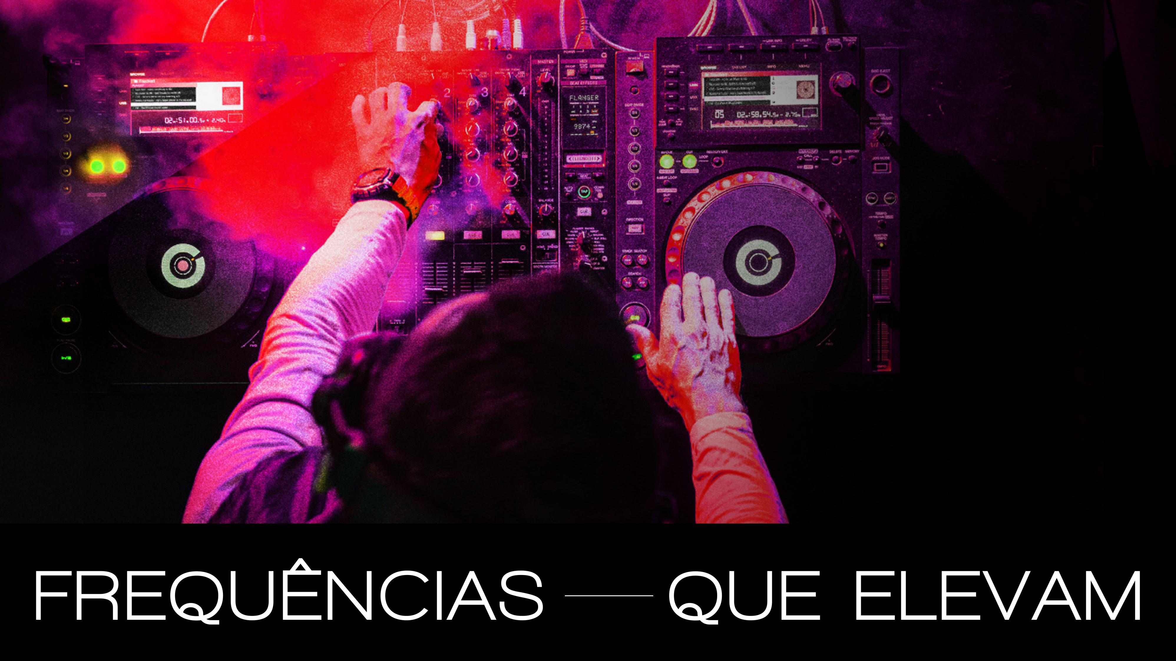
Frequencies that raise
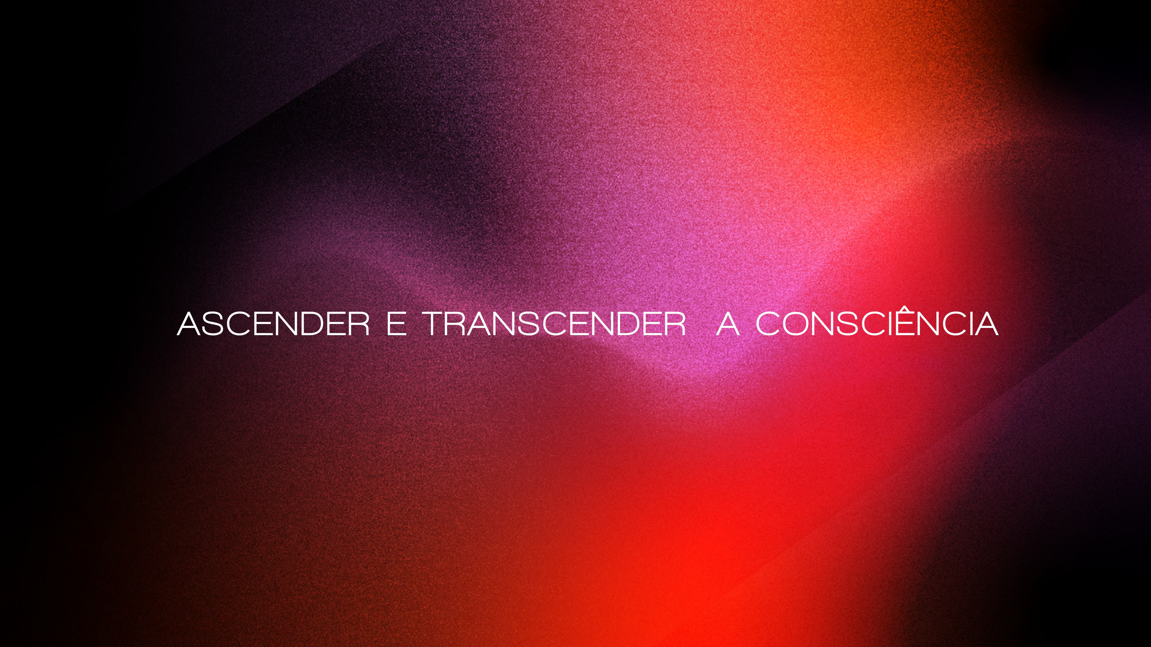
To ignite and transcend consciousness
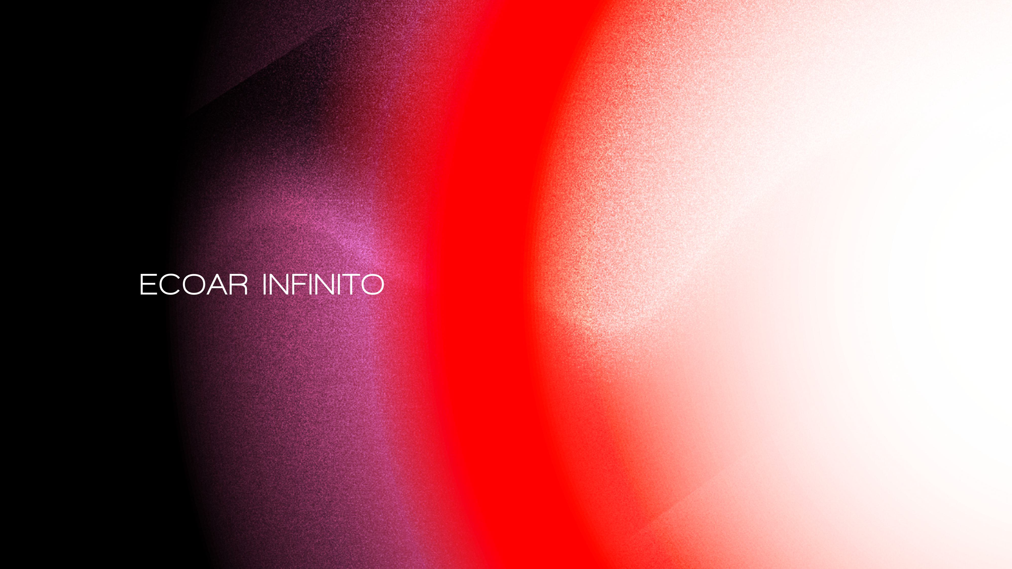
Echoing endlessly
To resonate between the visible and the invisible
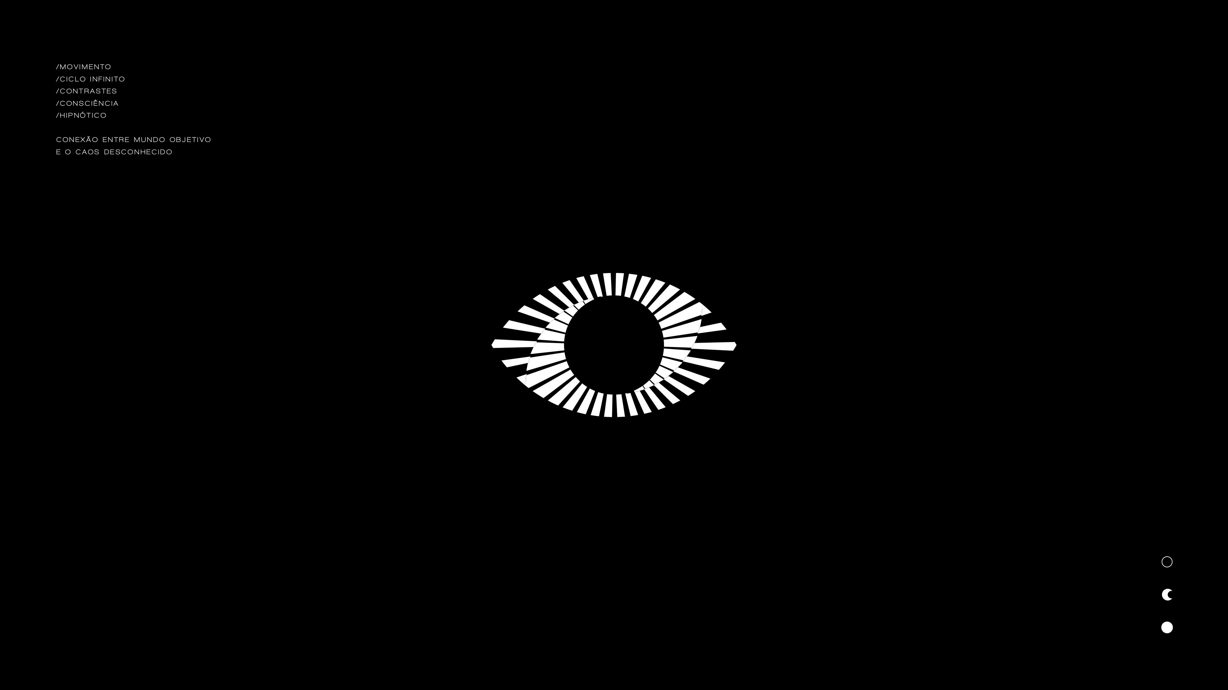
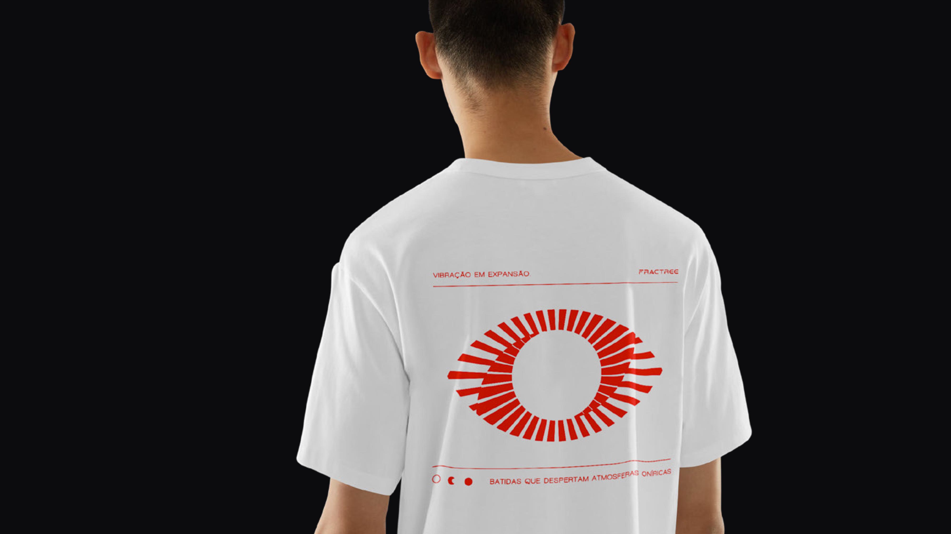
The Window of the Soul and the Transcendent Gaze. The central element of FRACTREE's visual identity takes the form of an eye, representing the "window of the soul" and the artist's portal of perception. This symbol acts as the vital link between the objective world, structured and tangible reality, and the unknown chaos, where infinite possibilities of creation reside. Through this "gaze," the brand invites the viewer not only to observe the sound but to feel and transcend common perception.
The construction of the logo and its graphic language was designed to evoke a state of deep immersion in cycles and contrasts:
Movement and Infinite Cycle: Like the concept of the Ouroboros, the design reflects an eternal journey of creation, destruction, and rebirth. Nothing is static; everything moves in patterns reminiscent of the rhythm of existence itself.
The Power of Contrast: The rigorous use of black and white symbolizes the extremes that underpin the essence of the project. It is in the absolute contrast between light and shadow that music becomes the connecting link between opposites.
Hypnotic World and Consciousness: Inspired by the logic of fractals, the identity creates a hypnotic atmosphere. The goal is to guide the audience's consciousness to new states, transforming the sonic beat into a dreamlike and transformative visual experience.
This symbol is the visual manifestation of the balance between order and chaos, capturing the essence of a project that walks the fine line between the logic of code and the pure emotion of music.



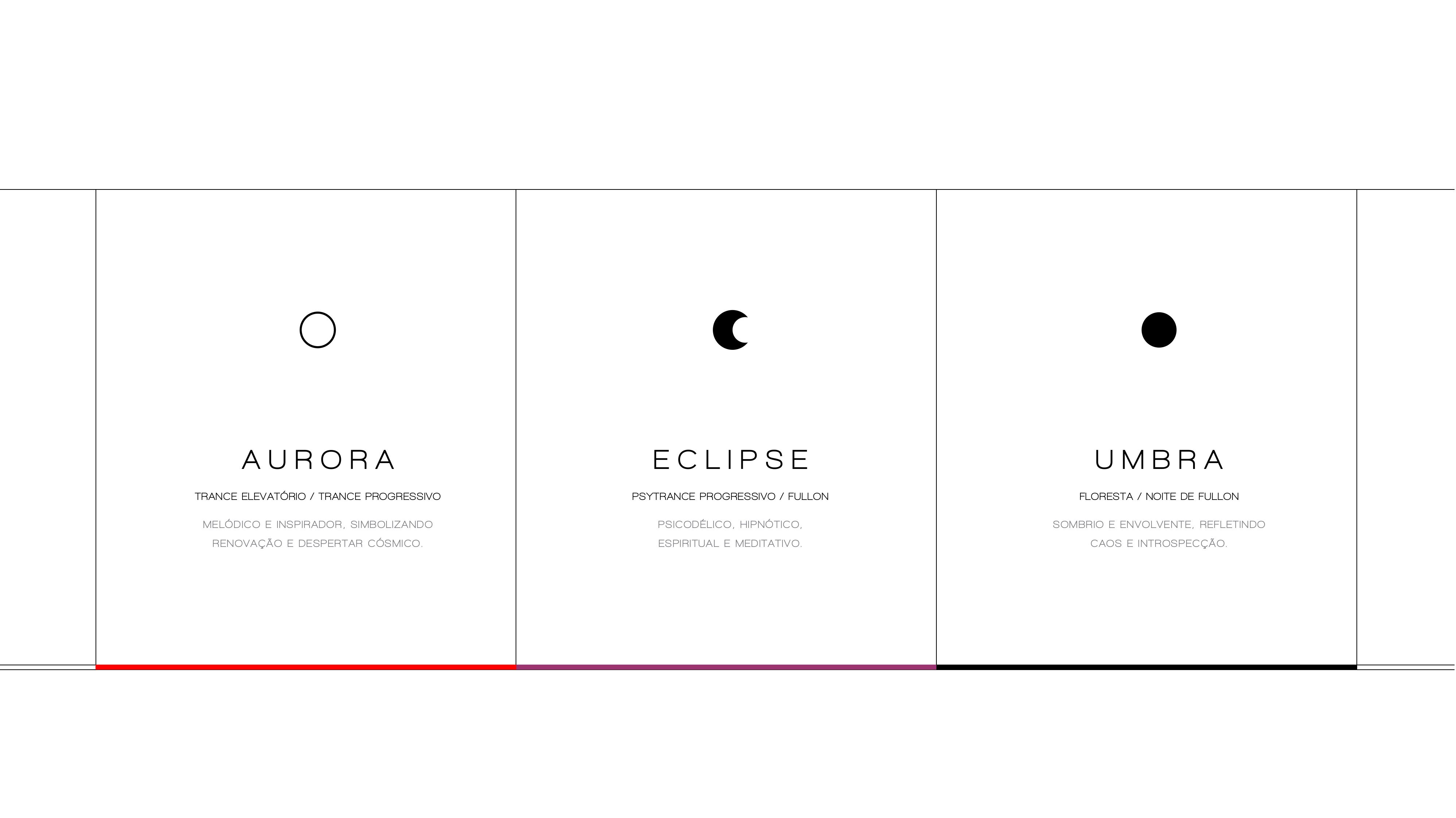
The brand unfolds into three distinct visual and sonic universes:
Aurora: melodic and inspiring tones that symbolize renewal.
Eclipse: a psychedelic and spiritual aesthetic focused on hypnotism.
Umbra: the dark and enveloping side that reflects chaos and introspection.
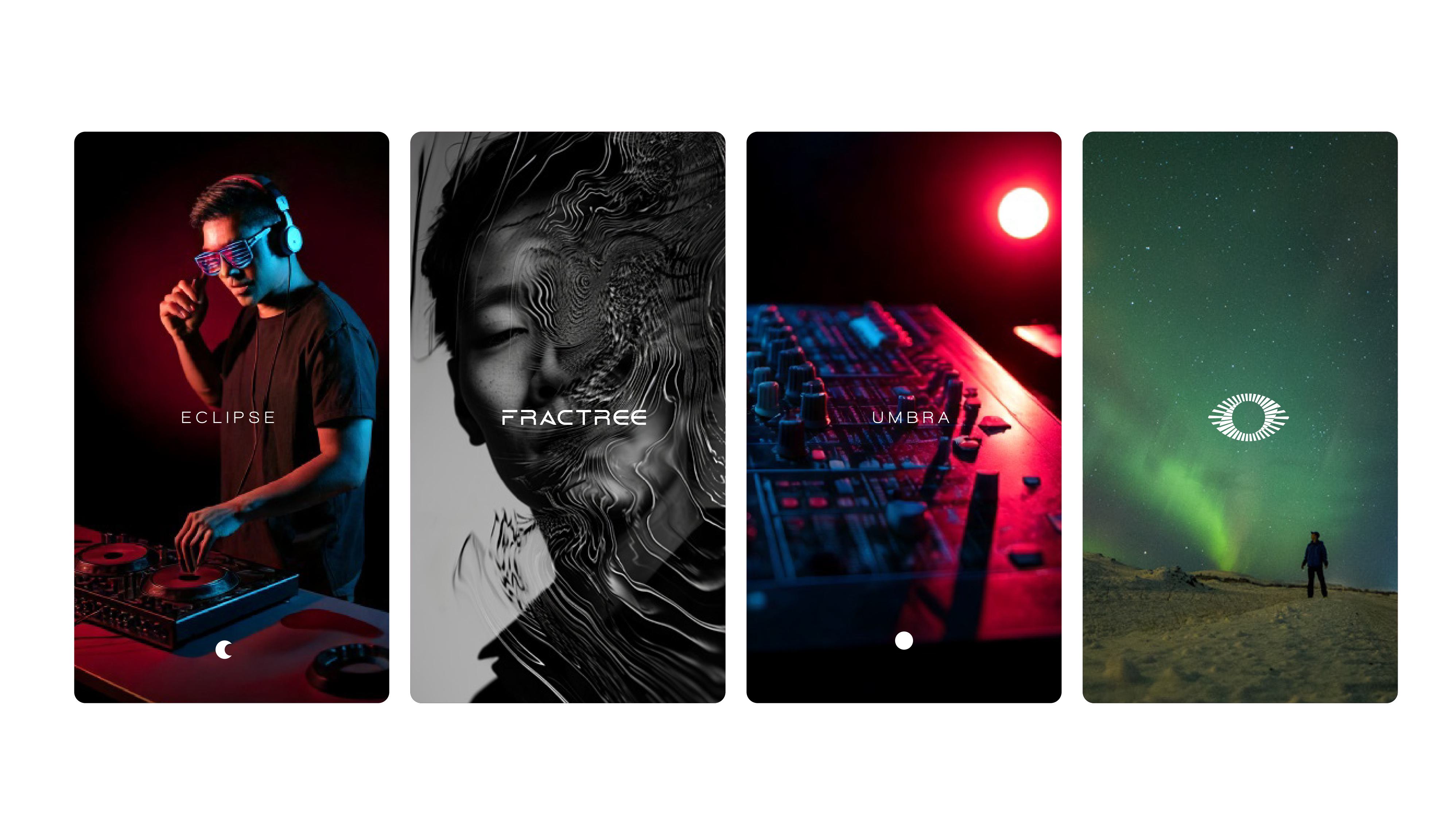
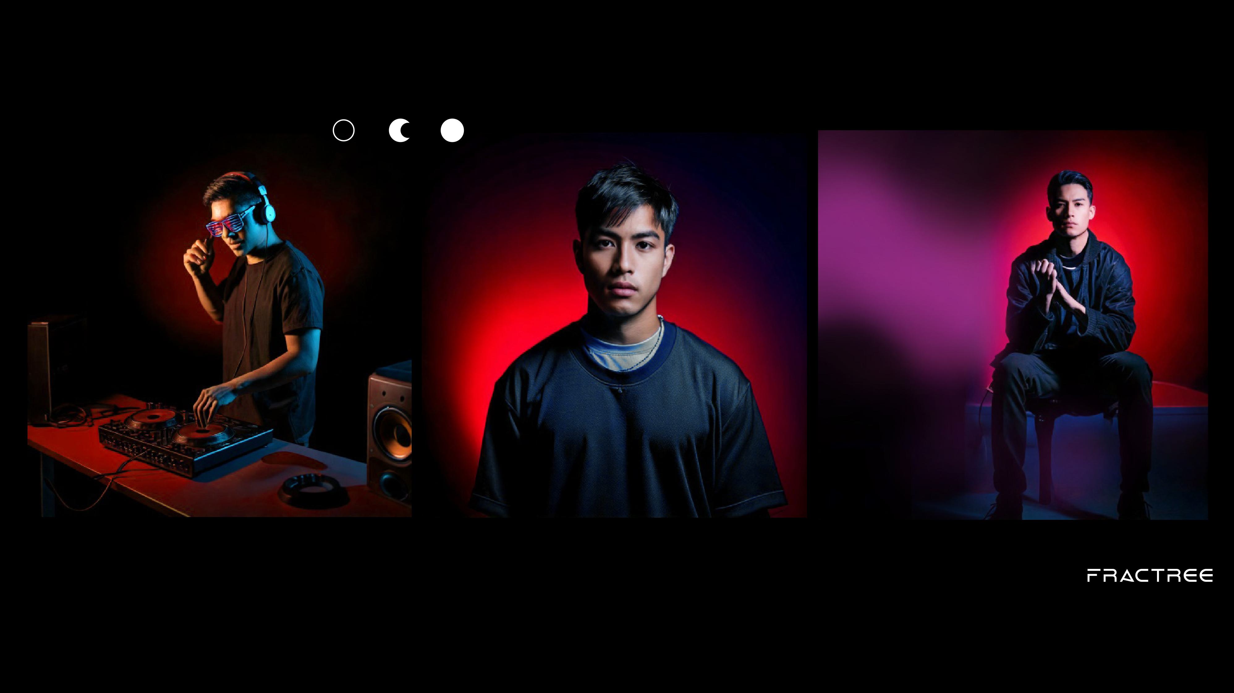
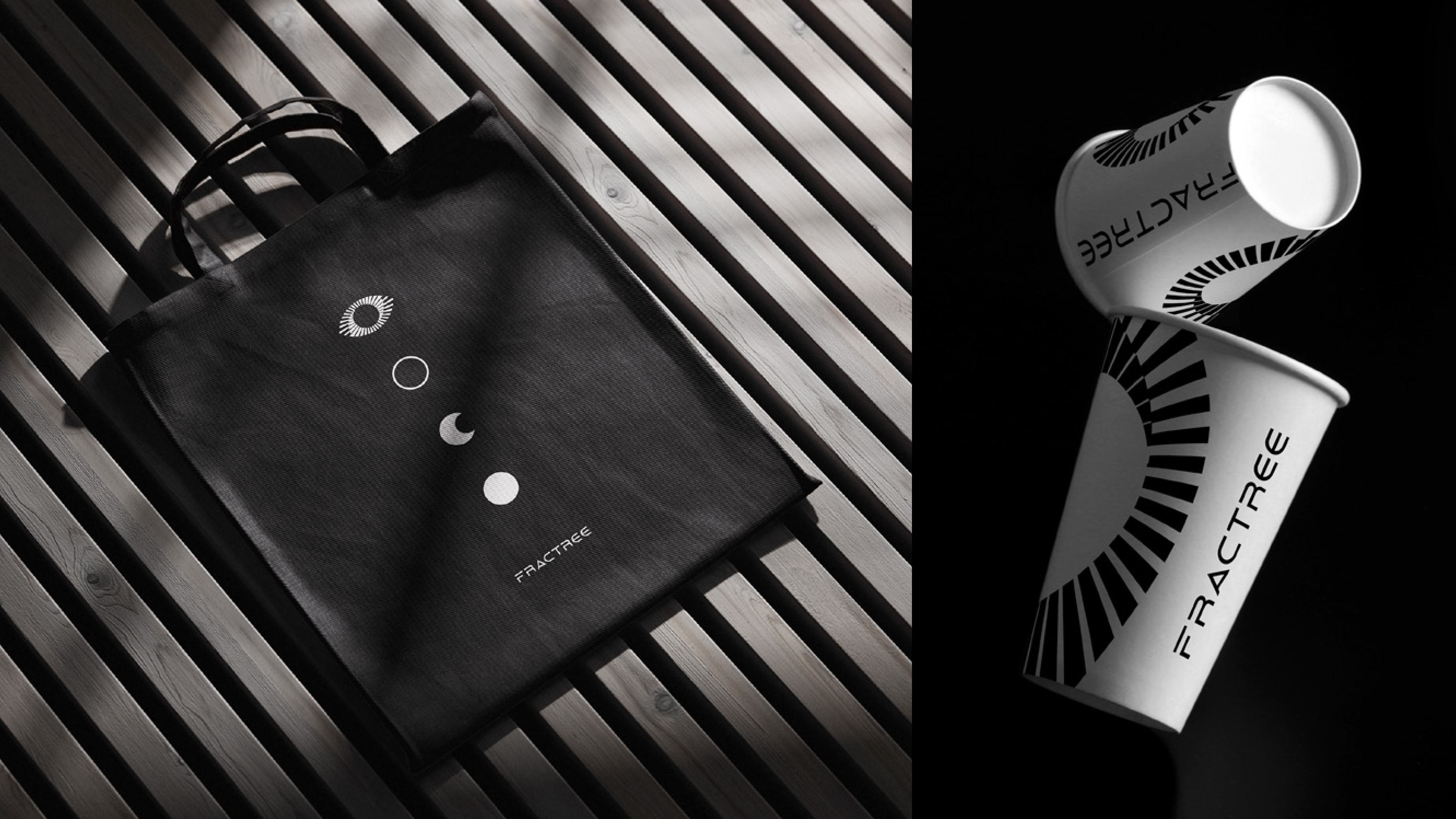

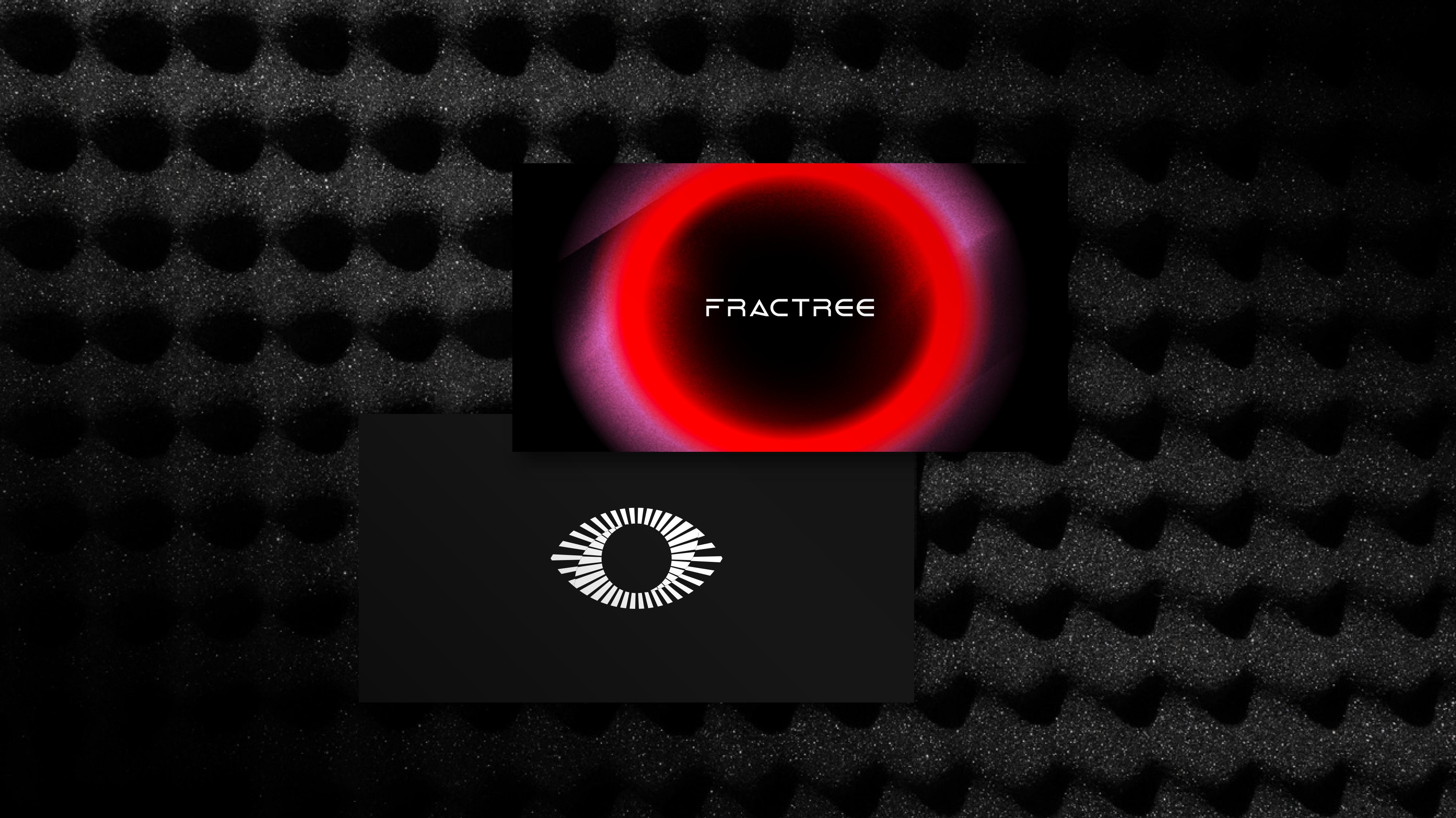
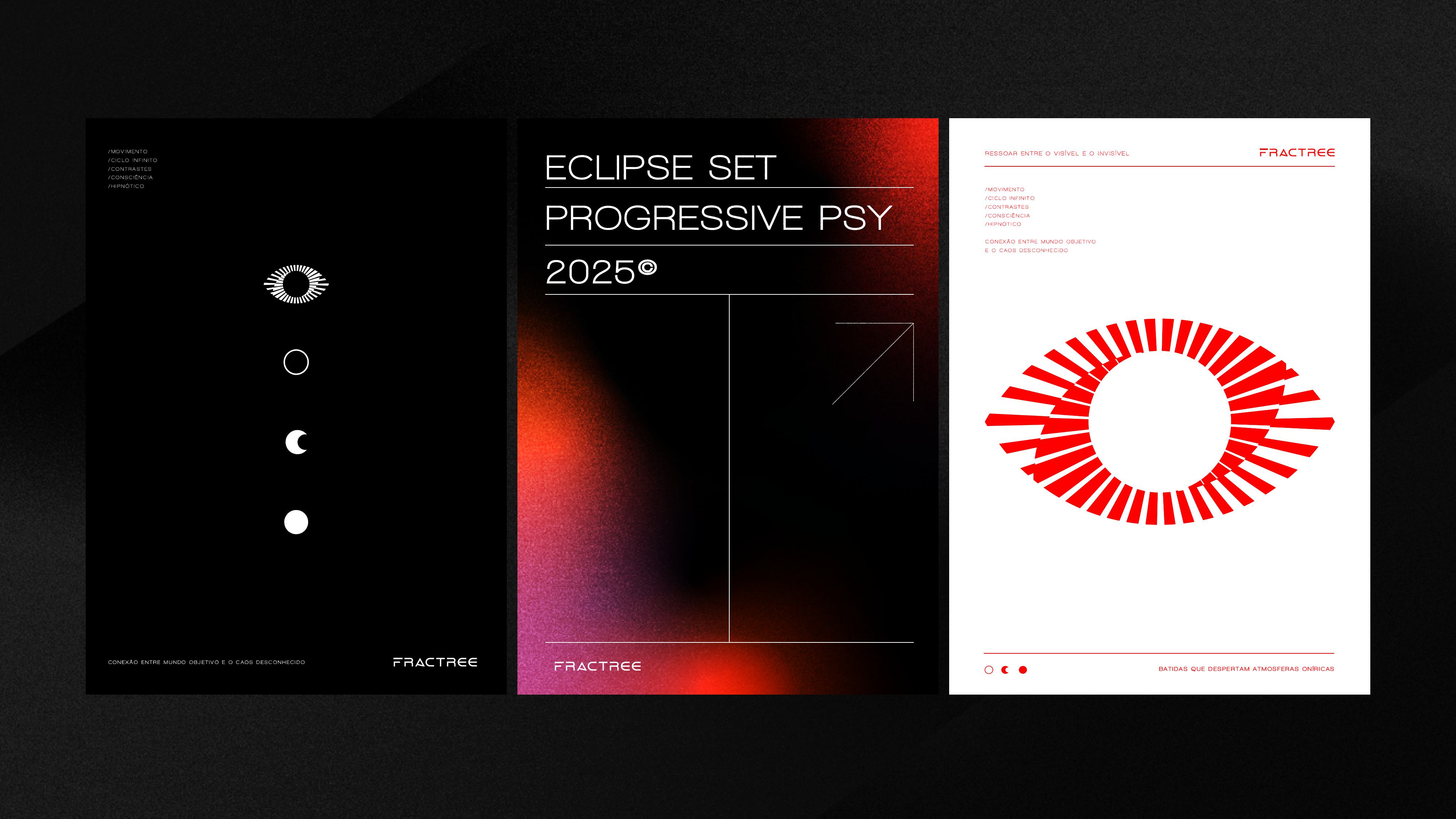
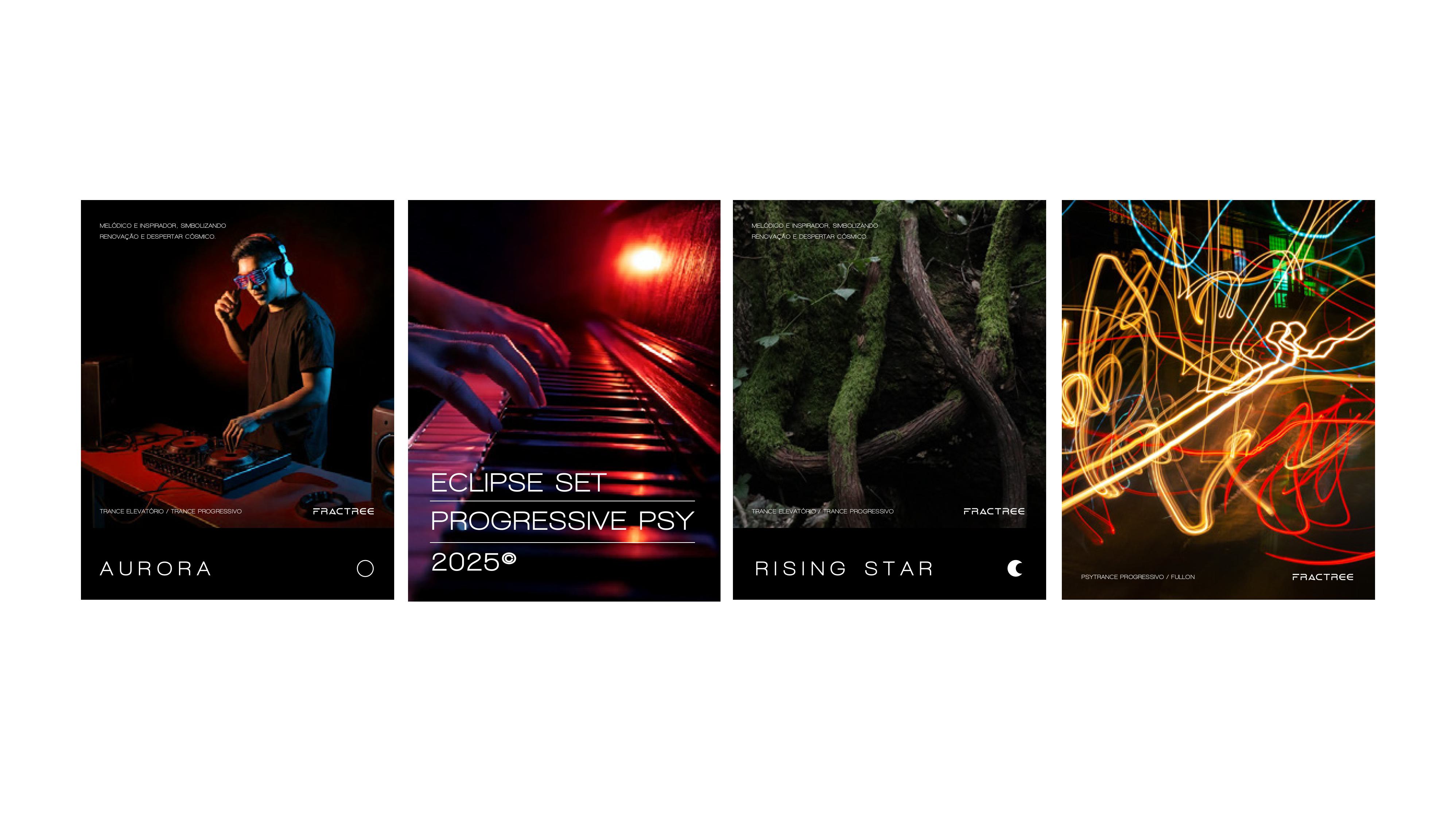
The visuals are guided by the concepts of movement, infinite cycle, and contrasts, serving as the ultimate connection between the objective world and the chaos of the unknown.
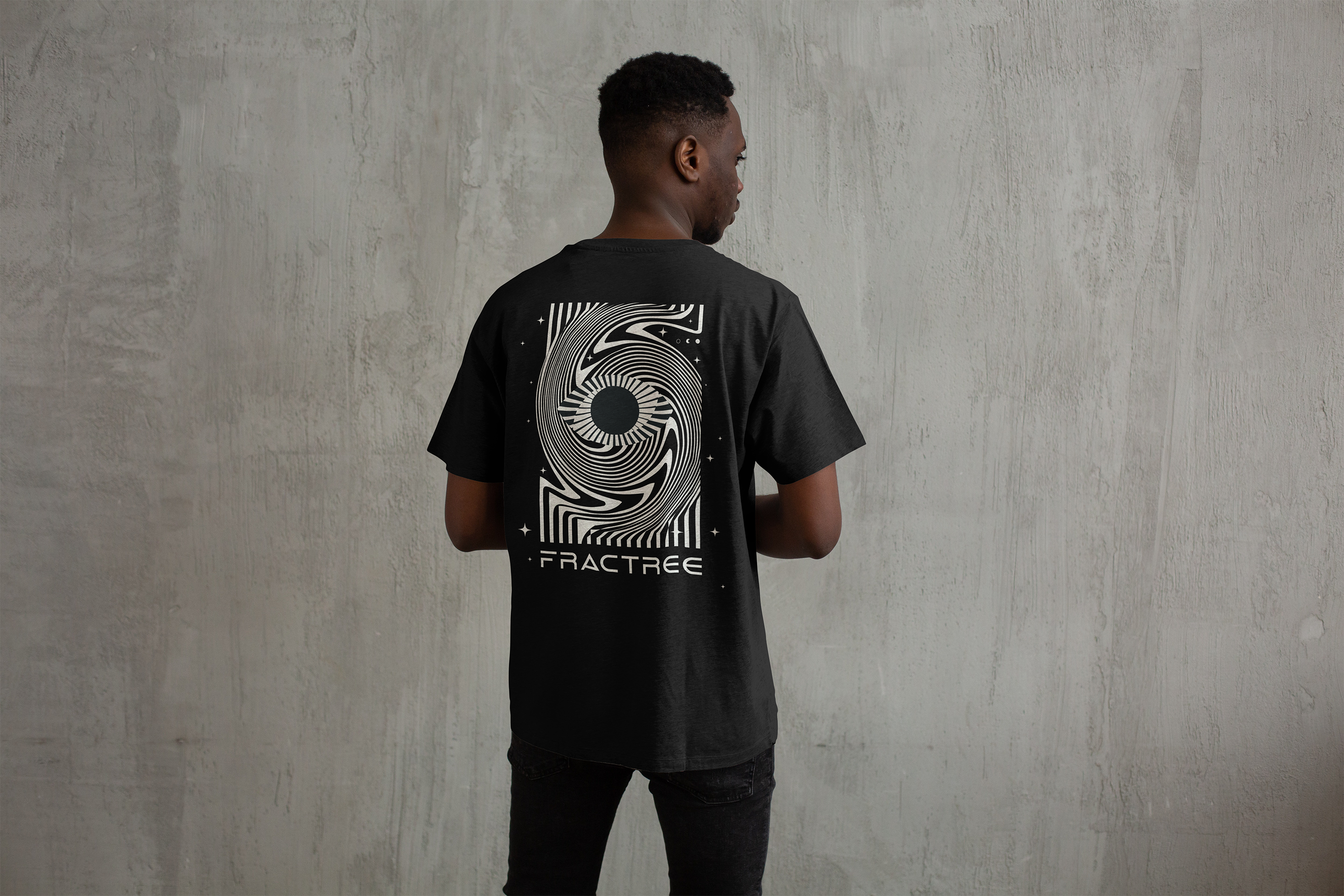
Project: Fractree Visual Identity
Design and Art Direction: Mariana Godoy
Year: 2025